


Rambus Blockbuster Chartology

By Catherine Austin Fitts
My “go to” website for technical analysis of precious metals, the US dollar & the US stock market is Rambus Chartology, where Rambus (that’s his handle – he’s the founding technical analyst) leads a discussion with extensive charts of what the markets are saying.
In January 2016, Rambus launched his quarterly Solari Report with a Blockbuster Chartology. You can find links to the entire series of quarterly and annual Blockbuster Chartologies at the end of this latest piece.
One of the reasons that Rambus is so good at his craft is that he focuses on “staying on the right side of the major trend.” The challenge of doing so at this time is that it is tempting to look for bottoms or to assume that the trend upwards in the US dollar or stock market may be over. However, Rambus consistently brings us back to the discipline of the Chartology. What does price tell us? As he describes so aptly, we are dealing with psychological warfare.
Sitting back once each quarter to get this perspective offers invaluable insight. So, here we go for the 3rd Quarter 2025 Wrap Up Blockbuster Chartology!
Blockbuster Chartology Quarterly Report
By Rambus
~ 3rd Quarter 2025 Wrap Up ~
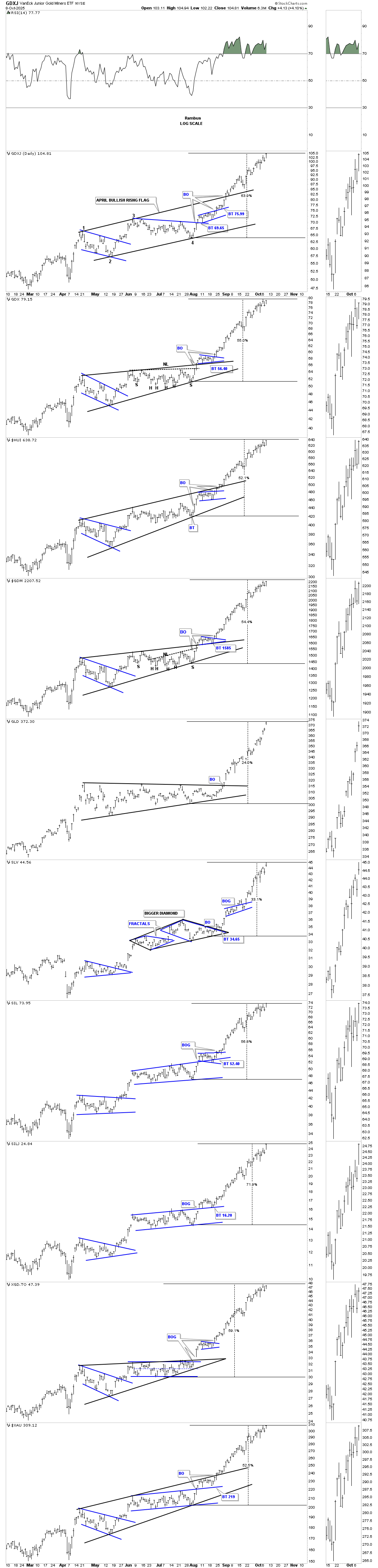
PM Complex: Potential Intermediate-Term Price Targets
Tonight, we’ll look at some of the standard charts we’ve been following and then look at some possible price objective charts based on several different approaches. Keep in mind that there are short-term, intermediate-term, and long-term price objectives that you need to be aware of.
The most important question you need to ask yourself is whether you are a short-term, intermediate-term, or long-term investor, as each different time frame needs to be tailored to your individual needs. You can also be an intermediate-term and long-term investor at the same time, raising some cash along the way but holding part of your portfolio for the long term, which is generally where the big profits will come from. It’s strictly an individual choice.
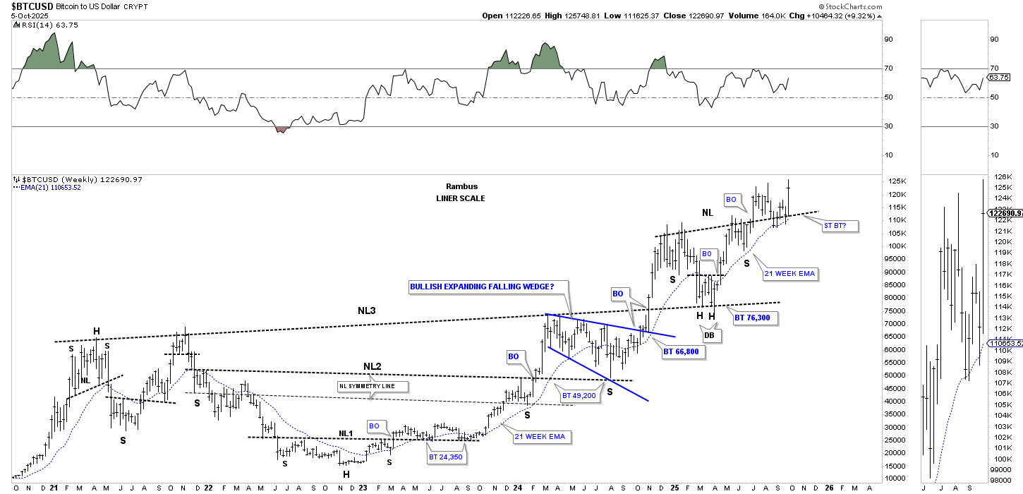
Let’s start with the 2-hour chart for BTCUSD, which now shows the completed double bottom reversal pattern with two H&S bottoms for each low. This weekend, the price action has already made a slight new all-time high before pulling back a bit.
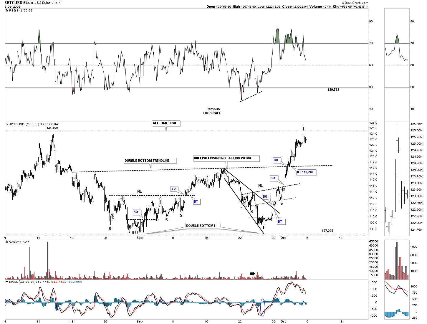
This is the original daily chart we first started using when the price action broke out from the H&S consolidation pattern, but the rally fizzled out shortly after the breakout of the neckline, which suggested a larger consolidation pattern may form. This weekend, the top rail of the blue flat-top expanding triangle was hit, completing the 4th reversal point. It’s possible we could see a small ping-pong move between the top rail of the flat-top expanding triangle and the double bottom trend line.
Also, I didn’t run the neckline all the way to the right side of the chart to show you how the left and right shoulder highs, which were resistance, turned into support during the formation of the double bottom on the blue flat-top expanding falling wedge.
Below is the exact same chart as the one above, but this one shows how the neckline held support during the formation of the double bottom on the flat-top expanding triangle, which is also the same pattern gold formed during its 2020 consolidation pattern.
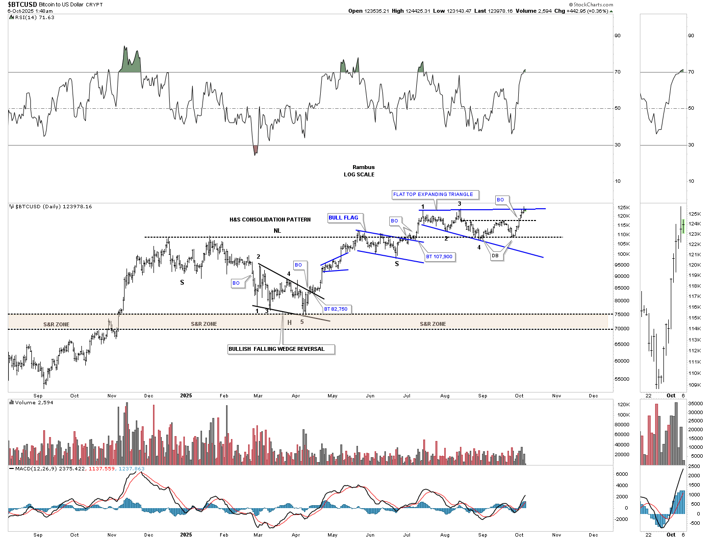
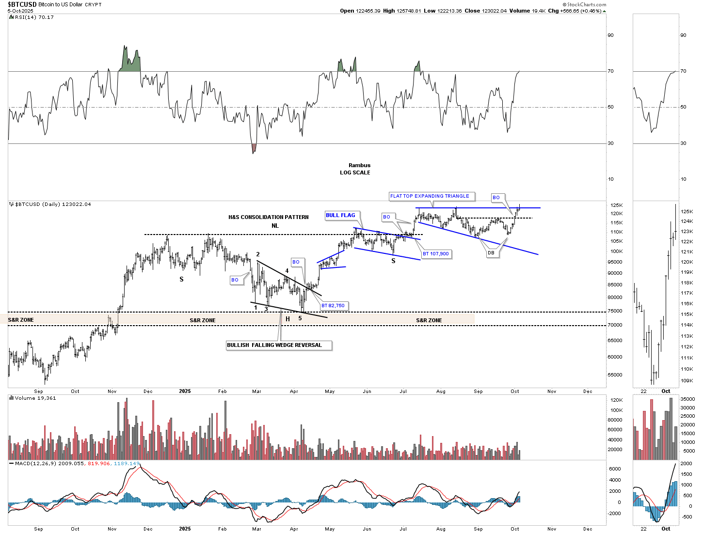
This is the longer-term log scale chart, which shows the much larger multi-year H&S consolidation pattern, with the smaller H&S consolidation pattern on the chart above forming the backtest.
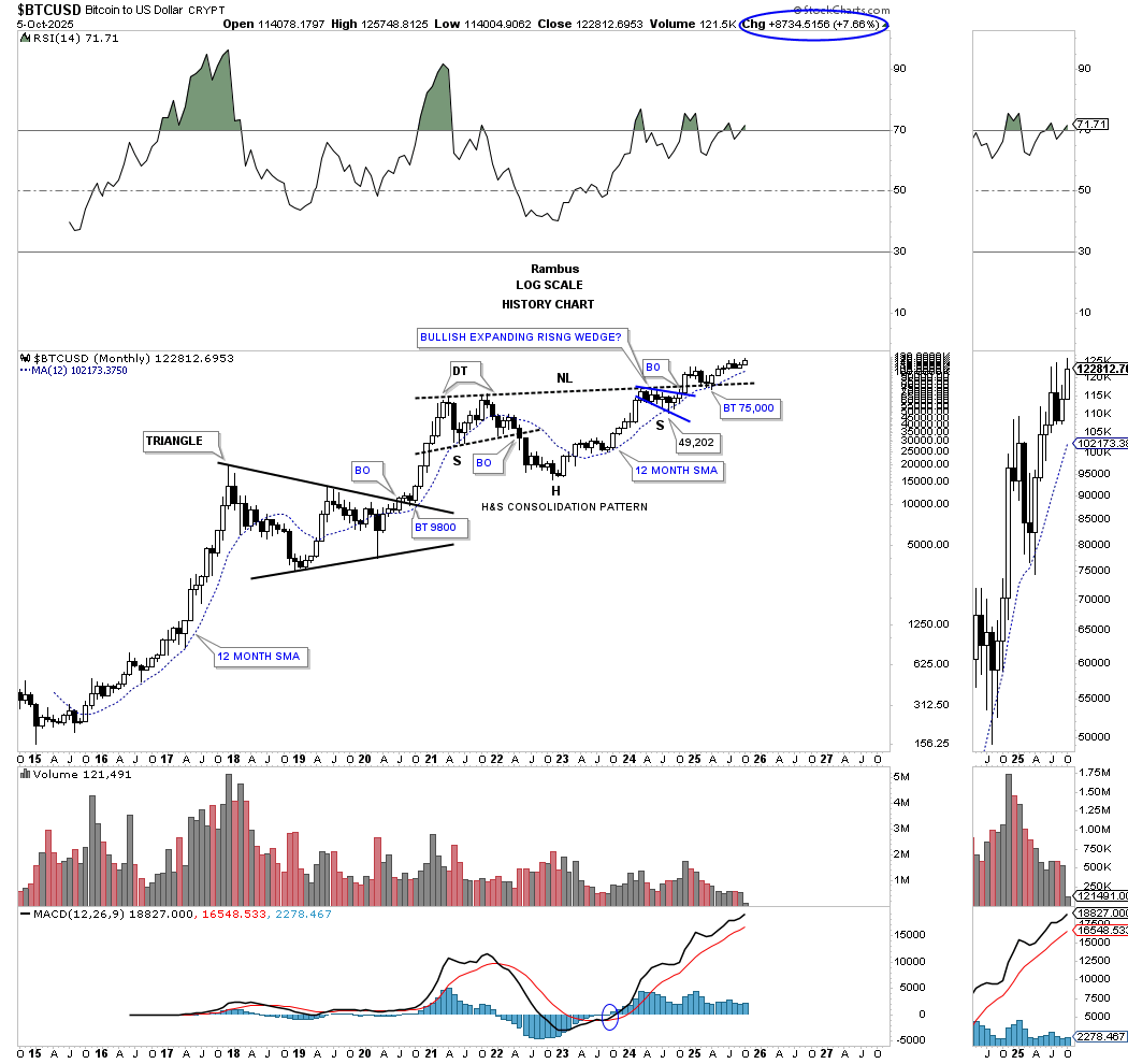
From the linear scale perspective, you can see how the smaller H&S consolidation pattern, two charts above, formed the backtest to the multi-year H&S consolidation pattern, with the 21-week EMA holding support on the backtest.
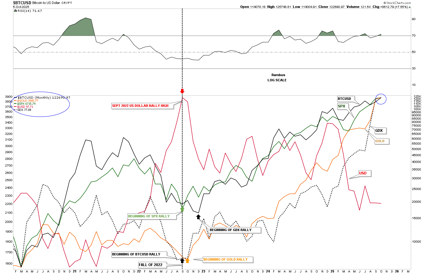
It’s been a while since we last looked at this monthly combo chart, which compares BTCUSD, the US dollar, gold, GDX, and the SPX. Note the vertical dashed line back in 2022, when the US dollar was topping and the others on this chart were in the bottoming process. Then, in late 2024, the US dollar started to decline once again, while the other indexes on this chart have all rallied strongly and are performing about the same, blue circle, rising in their bull markets. As long as the US dollar keeps declining, it should be a good tailwind for BTCUSD, gold, GDX, and the SPX.
Below is the daily chart for the CDNX, which we’ve been following very closely. Last week, the price action gapped above the 910 resistance line we looked at on the weekly chart and closed the gap before moving higher into the end of the week. Note how the volume has been increasing as investors are starting to find their way into the junior and micro-caps.
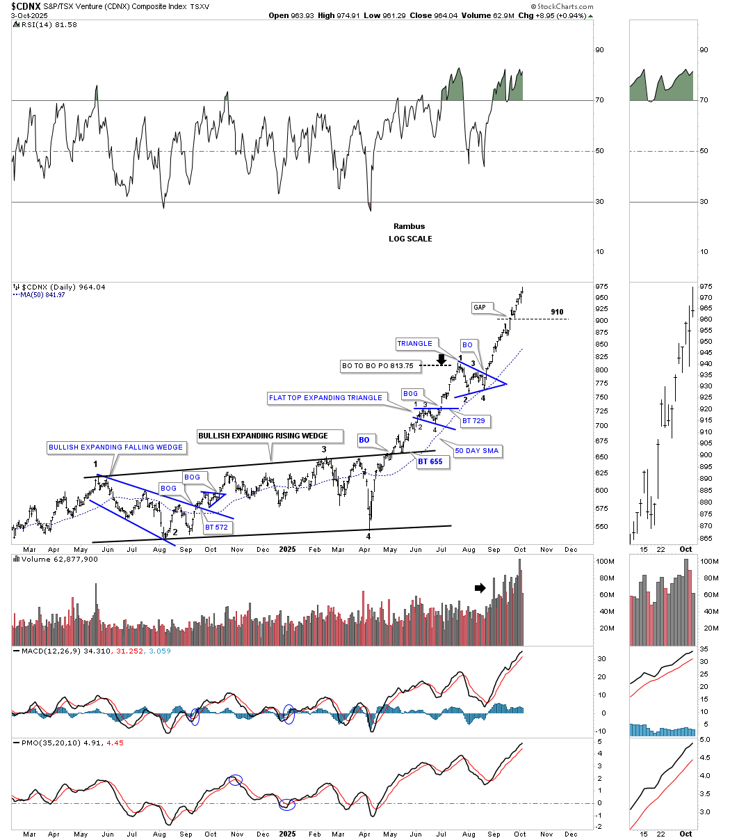
This weekly chart shows the clean version of the double inverse H&S bottom and the breakout above the 910 resistance line. There shouldn’t be much in the way of resistance now until the next high is reached around the 1025 area.
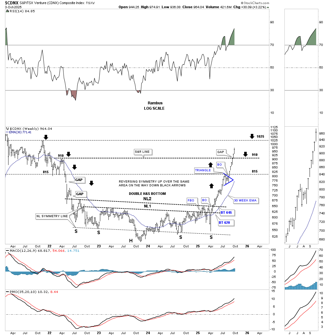
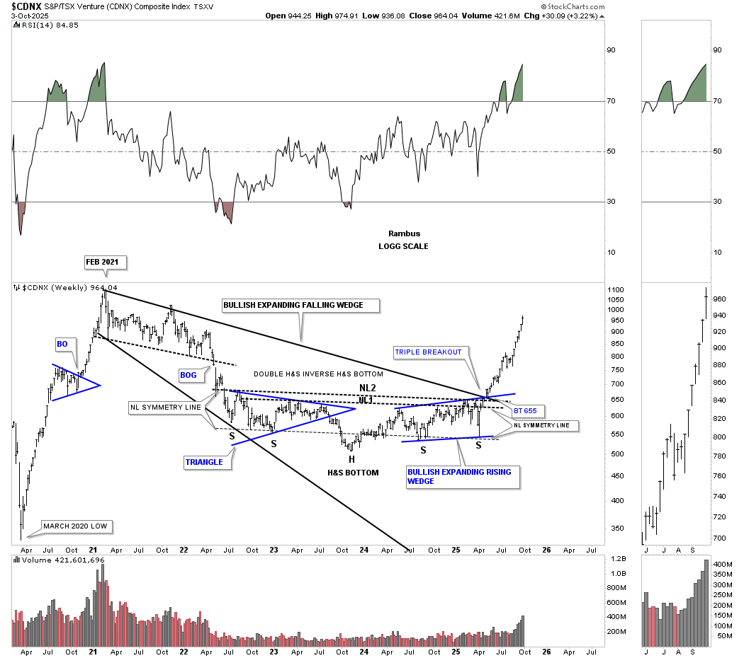
This is the more complex double H&S bottom, which also shows the February 2021 bullish expanding falling wedge. Note the triple breakout where the top rail of the 2021 expanding falling wedge, NL2, and the top rail of the blue bullish expanding rising wedge intersect. You may have noticed that many of the junior and micro-caps in the portfolios also have a large expanding falling wedge or a similar large consolidation pattern that have been breaking out recently.
This monthly history chart shows that the previous high of the blue 5-point bearish falling wedge reversal pattern comes in around the 1115 area, which may offer some initial resistance when reached.
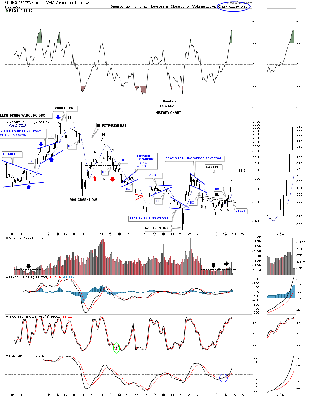
This is a new chart I just built using the previous triangle consolidation pattern as a halfway pattern; see the daily chart above. If the blue triangle ends up forming a halfway pattern in both time and price, then we could see the CDNX reach the 1115-1135 area, the brown shaded price objective zone, sometime in early December. You can see on the monthly chart above that 1115 was the high for that bearish falling wedge reversal pattern.
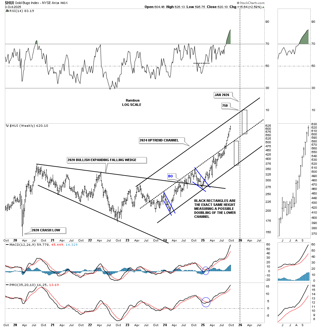
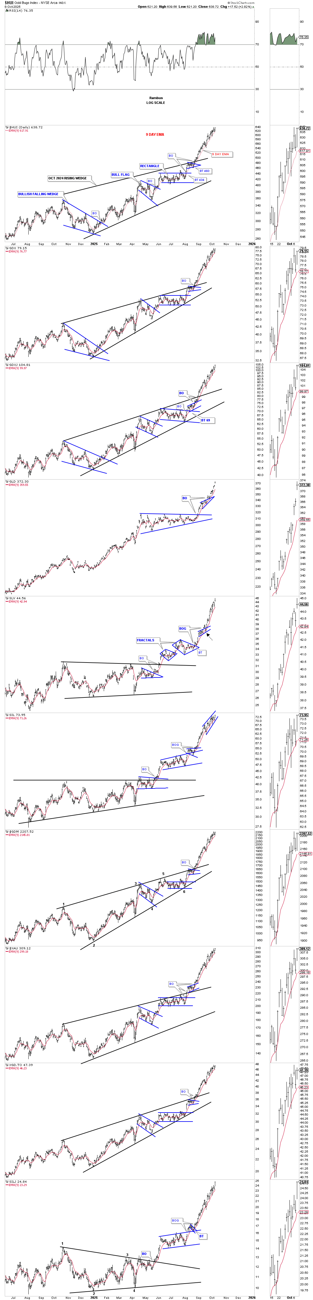
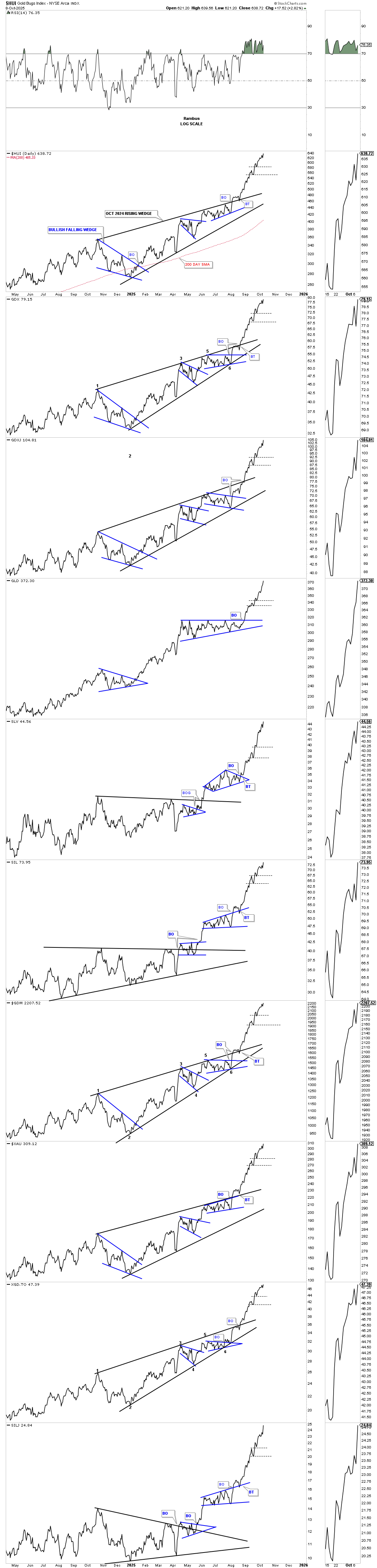
We first looked at this shorter-term April bullish rising wedge a while back, which had a price objective up to the 645 area, as shown by the black arrows. So far, the HUI has reached about 626. If the HUI stalls out in this general area, it could be setting up for a possible new consolidation phase.
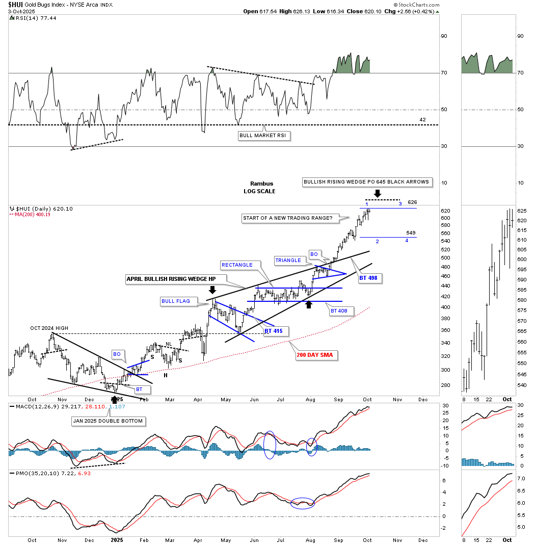
Below is the daily bar combo chart showing the large October 2024 bullish rising wedge in most cases. One of the first signs the PM stock indexes may be ready to start forming a small consolidation pattern is if the price action starts trading below the red 9-day EMA. For now, something we can keep an eye on.
Something else we can keep an eye on is if we begin to see a new lower low form, as shown by the horizontal thin dashed lines.
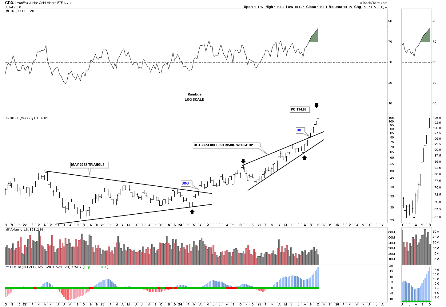
This weekly chart for the HUI shows the May 2022 triangle along with the October 2024 bullish rising wedge. These two patterns are a good setup for the October 2024 bullish rising wedge being a halfway pattern to the upside. I have two different price objectives, as shown by the blue and black arrows. The more conservative price objective would be taken from the 4th reversal point in the October 2024 rising wedge, blue arrows. The higher price objective is taken from the 6th reversal point, black arrows.
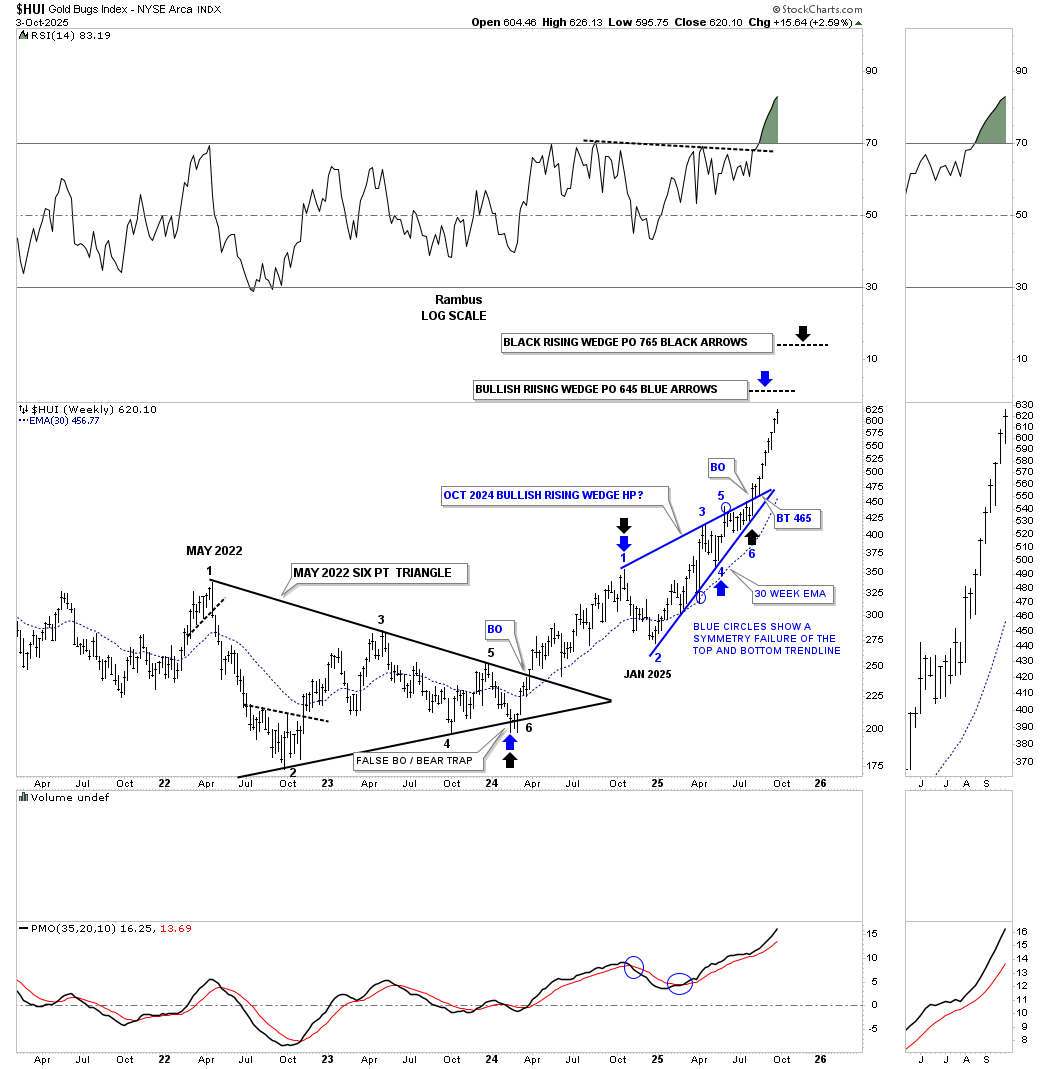
This next weekly chart for the HUI uses a different method to look for a possible price objective. After breaking out from the 2020 bullish expanding falling wedge, the HUI had been trading in the lower half of the 2024 uptrend channel. In the past, we’ve looked at how a channel can double in price when the price action is locked into the lower half of the channel.
The black thin rectangles are the exact same height and measure each half of the uptrend channel. Once the price action broke above, which is now the center dashed midline, we got the go-ahead to add the second channel line above the first. It’s going to depend on when the HUI reaches the top trend line before we know the real price objective. I’m just using the January 1, 2026, time frame as a time indicator.
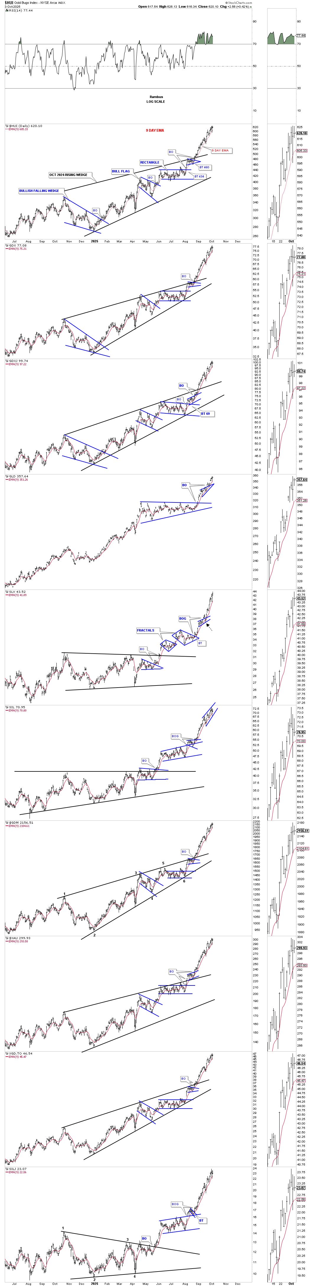
This daily combo chart shows the April rising wedges in most cases and the percentage gains they have made since the August low, which is becoming quite substantial in just a couple of months.
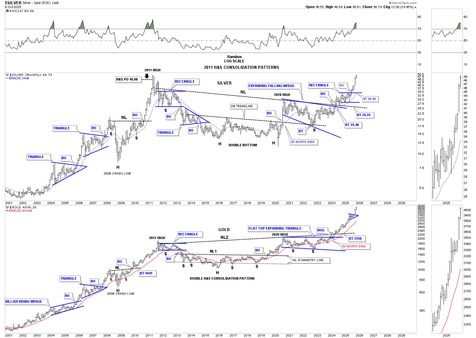
Next is a long term weekly combo chart which goes all the way back to the 2011 high. What this chart is showing is that the 2016 low, in most cases, which was the bear market low, the price action has carved out a 5 point bullish expanding rising wedge reversal pattern. You can see how that pattern is made up of the two smaller blue consolidation patterns we followed in real time as they developed, which are the 2016 bullish falling wedge and the 2020 bullish expanding falling wedge.
Note how vertical the rally has been since the breakout of the top trend line, which confirms the bullish expanding rising wedge as a reversal pattern. You can even see the breakout gap above the top rail on the XGD.TO, which is extremely rare. Big patterns lead to big moves.
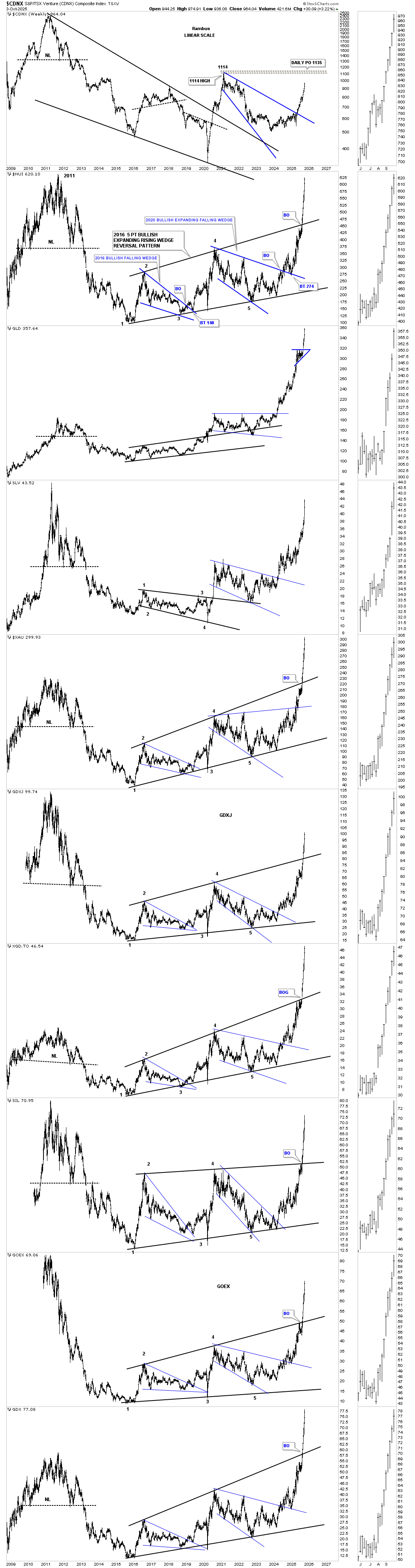
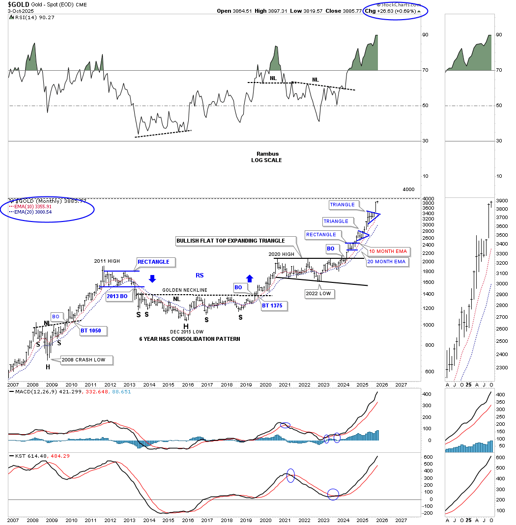
From this monthly log scale chart, you can see the double bullish combo: 2020 bullish expanding falling wedge/H&S consolidation pattern. I measured the H&S pattern to get the minimum price objective, which is not that far higher. Keep in mind that is the minimum price objective, which I expect to be greatly exceeded over time
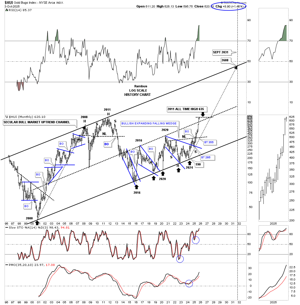
This monthly chart for the HUI shows its 2000 secular bull market parallel uptrend channel, with the price action just now closing over the center dashed midline and testing the all-time high around the 635 area. Earlier, we looked at the HUI, in which it was possibly doubling its smaller uptrend channel. This much larger version shows the same possibility of a doubling of the lower channel to the upside, with the first step in place: a close above the center dashed midline.
The long black arrow, taken from the 2000 low to the 2008 high, shows the time and price objective. If we take that exact same long black arrow and start it at the last touch of the bottom trend line, we can see a possible price objective up to the 2608 area, which would be conservative because the HUI put in a higher high in 2011, three years later than the 2008 high.
Below is the daily chart for gold, which shows the breakout from the 8-point triangle consolidation pattern and then the bullish expanding rising wedge, which has a price objective up to the 3991 area, just below the big round number of 4000, a psychological number in investors’ minds, which would be a good place to see a consolidation pattern start to form, as shown by the blue arrows. The black arrows measure the 8-point triangle as a halfway pattern up to the 4200 area, which would be the ultimate intermediate-term price objective.
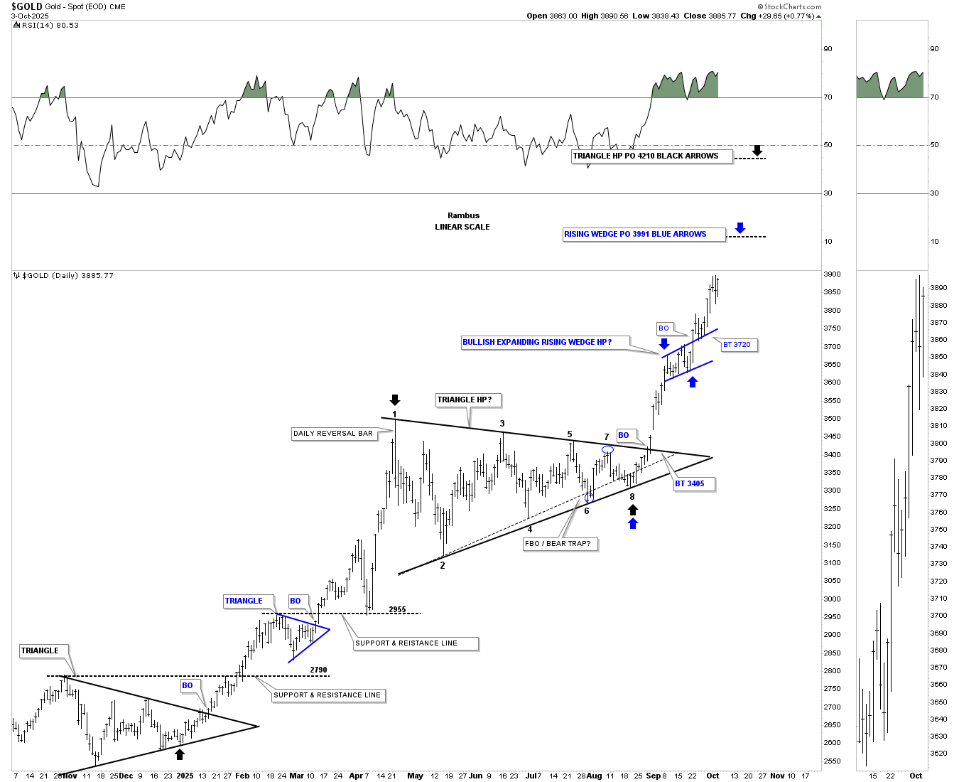
This monthly chart shows just how close gold is getting to that big round number of 4000. On the bottom left side of the chart, where the 2008 H&S consolidation pattern is located, the neckline came in right around 1000. The 2011 high came in just under 2000, while the 3000 round number came in between the current two blue triangles.
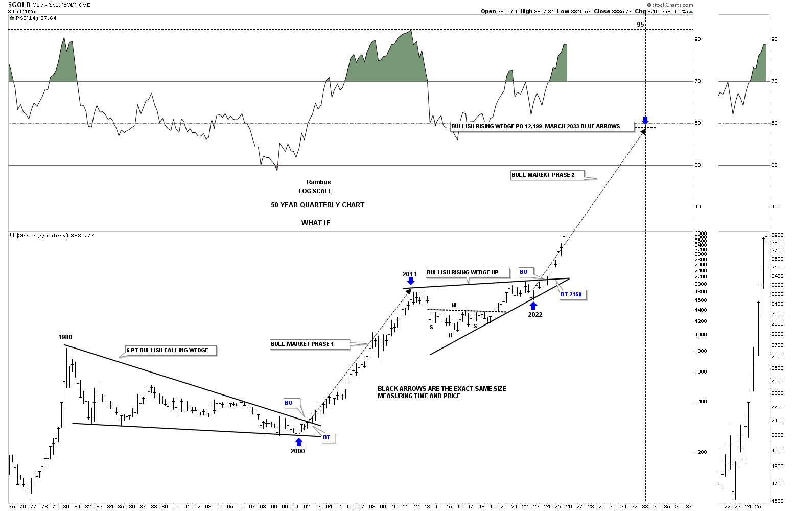
Golds long term price objective as shown by the long back arrows.
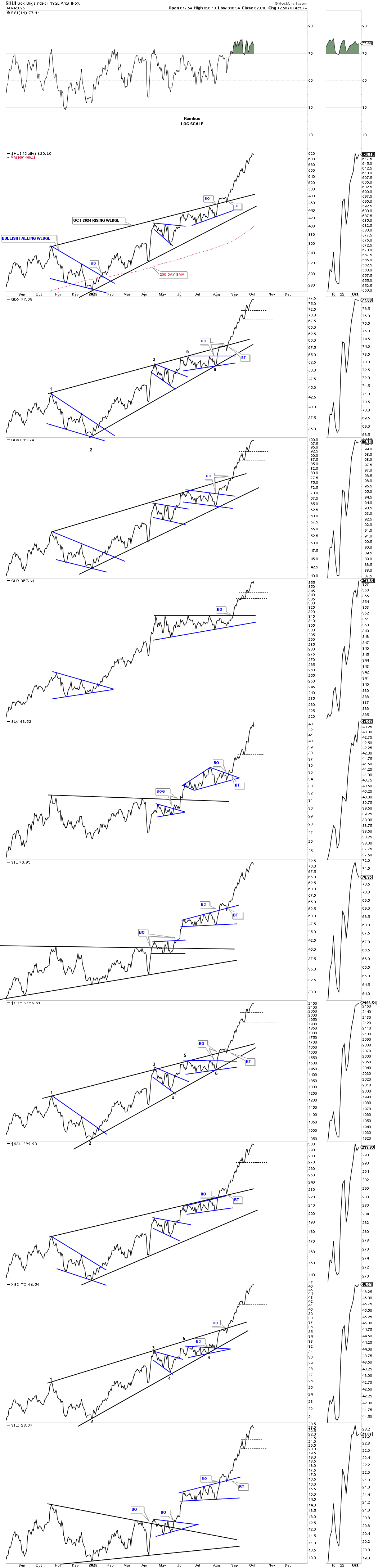
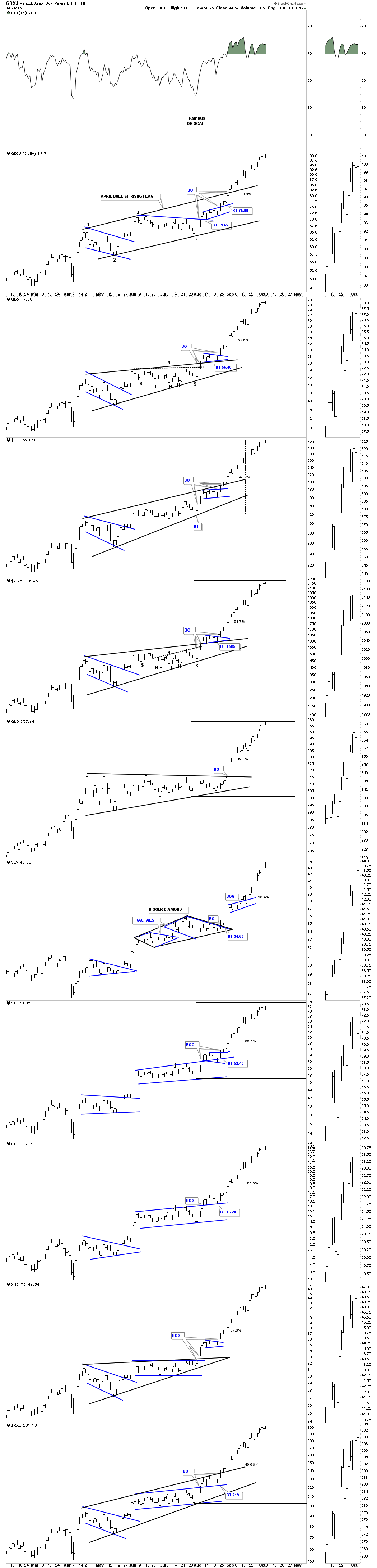
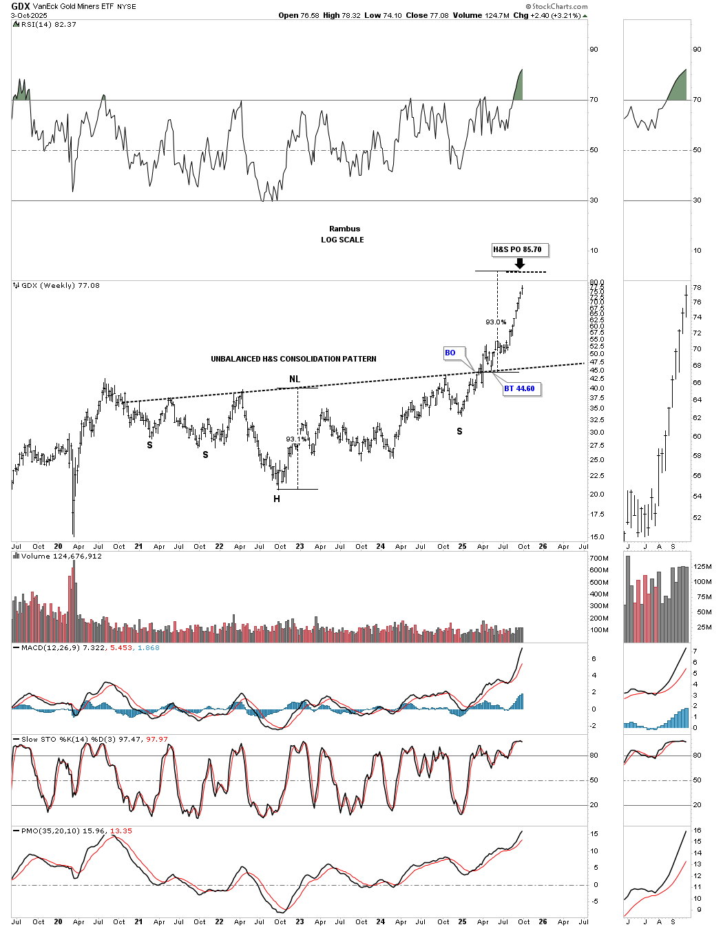
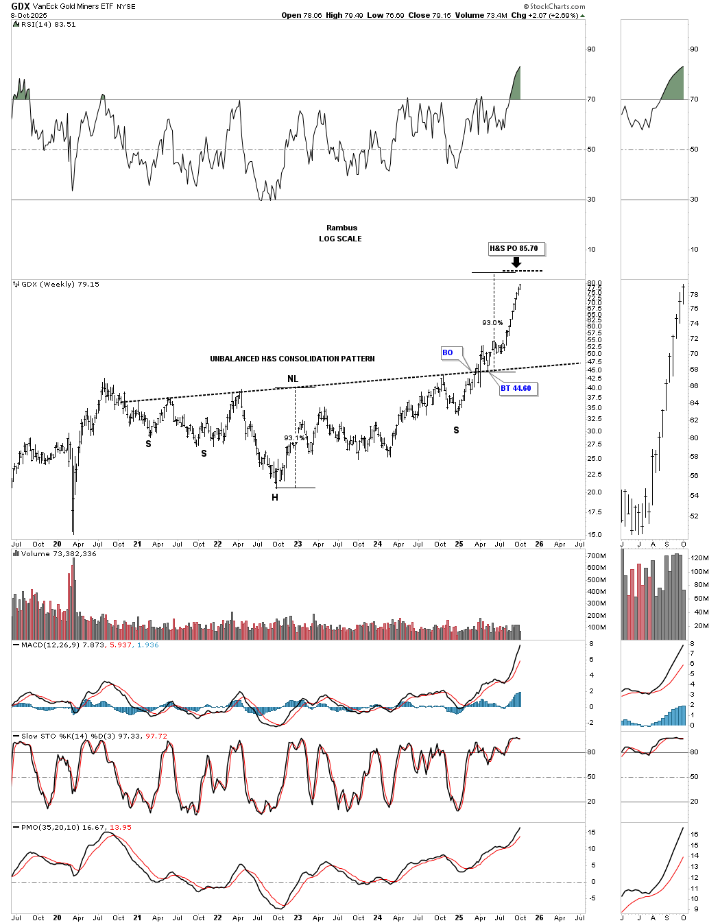
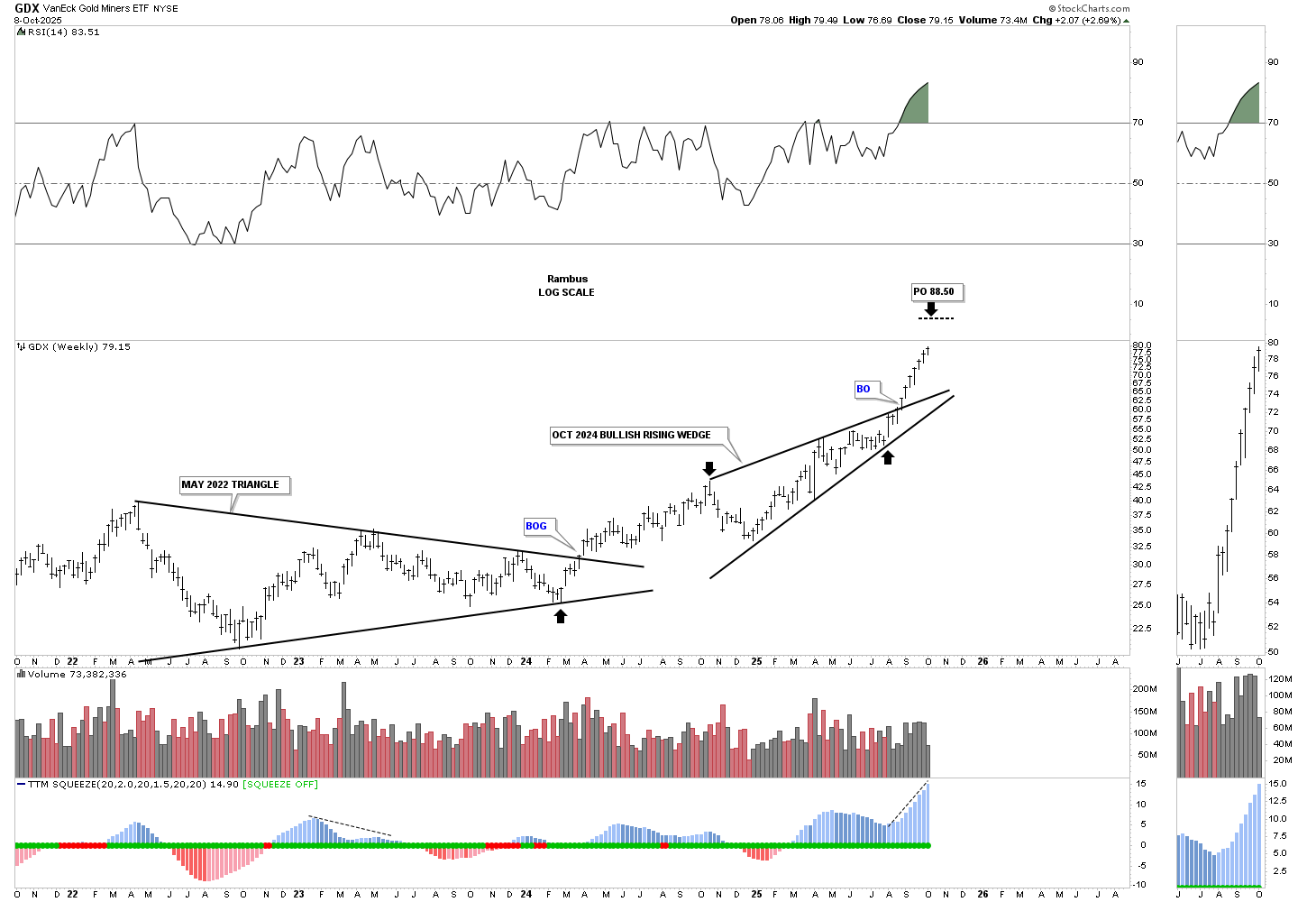
“Now I would like to show you two different price objectives for the GDX and the GDXJ, based on two different chart patterns, which may help confirm where they are headed from the intermediate-term.
This weekly chart for the GDX shows its possible intermediate-term price objective based on the October bullish rising wedge being a halfway pattern between the May 2022 triangle and the price objective up to the 88.50 area.

This is where it gets interesting. Below is another weekly chart for the GDX, which shows the minimum price objective for the H&S consolidation pattern up to the 85.70 area. Between the two different weekly charts and patterns, there is just a $3.00 difference between the two separate price objectives.
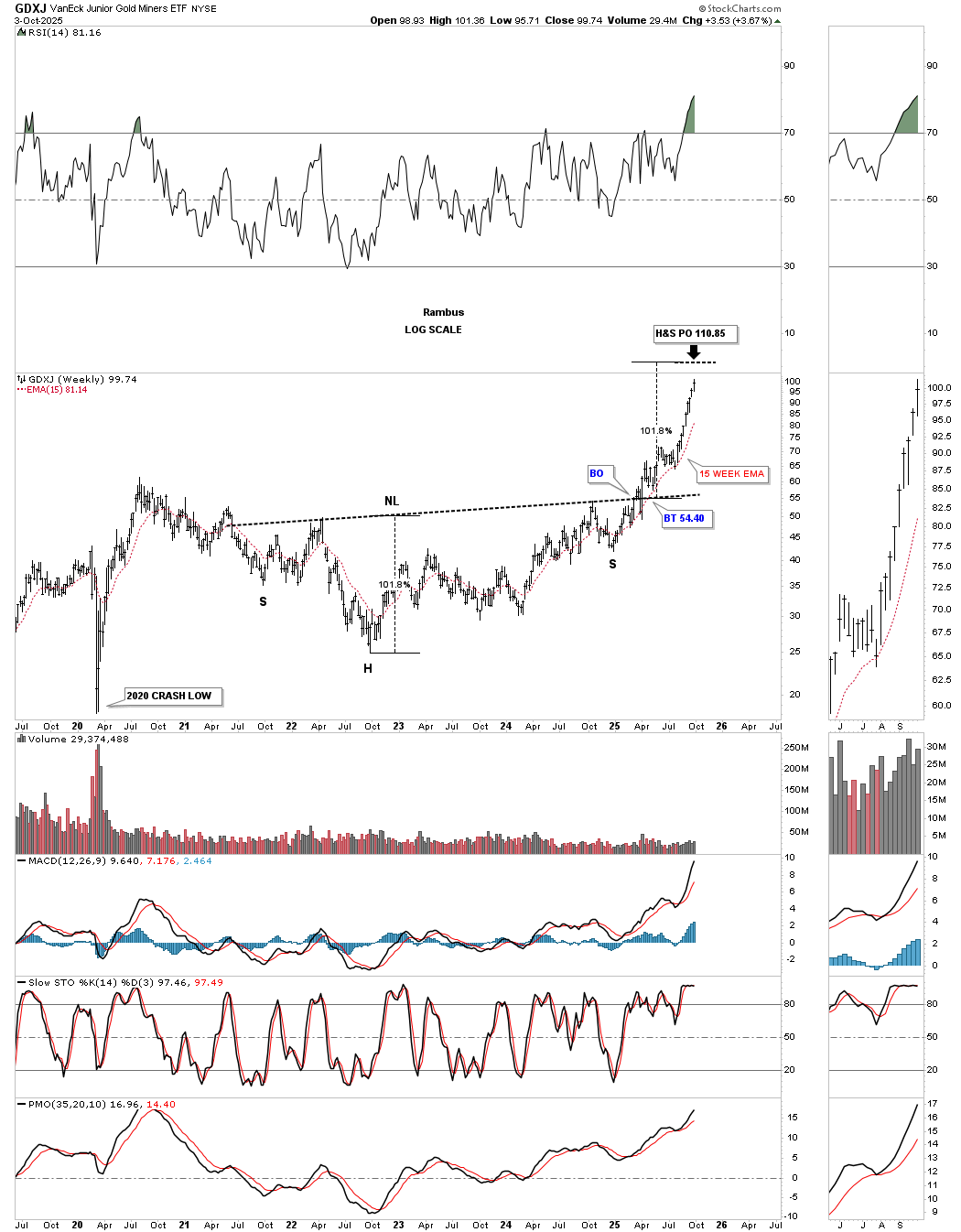
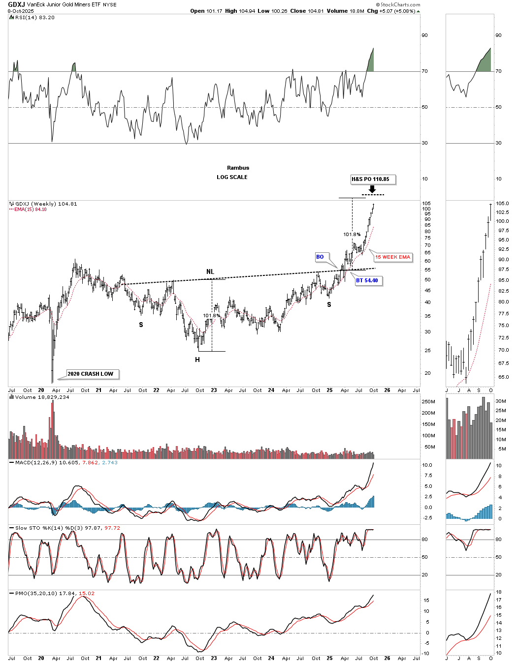
Next is the weekly chart for the GDXJ, which again shows its May 2022 triangle and the October 2024 bullish rising wedge as the halfway pattern. Here, you can see the price objective is up to the 114.96 area.
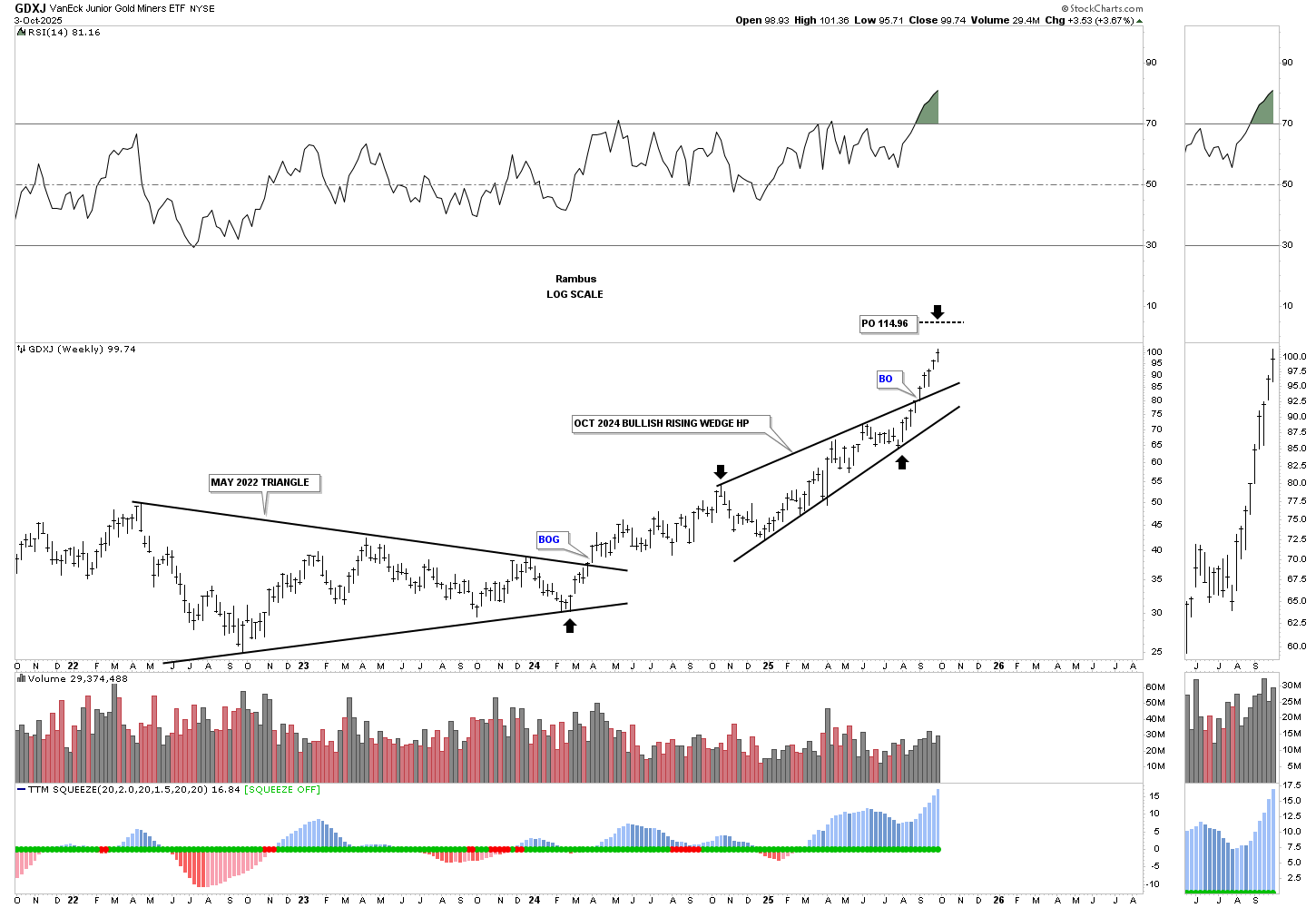
The multi-year H&S consolidation pattern has a minimum price objective up to the 110.85 area, or roughly just $4.00 different from the rising wedge price objective.
The inevitable correction is coming, but from what level and time frame? We have some good chartology we can follow to help us in determining when the next consolidation phase is going to take place. I can tell you with 100% confidence that we won’t get the last tick high, but hopefully, we can get fairly close to the intermediate-term high, which is not going to be easy. Hopefully, there will be a small reversal pattern form at the high to go along with the different price objectives we discussed tonight. All the best…Rambus.
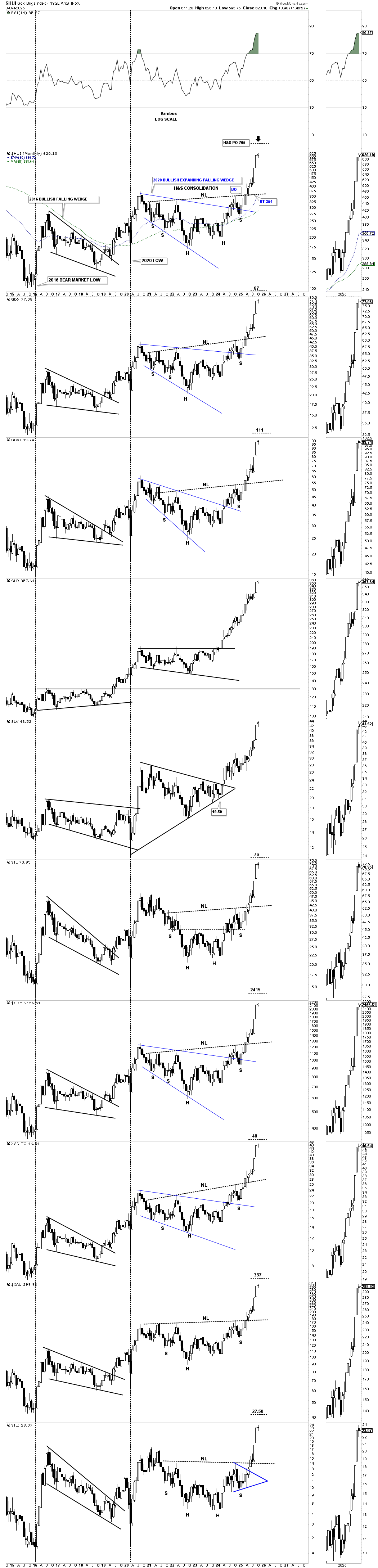
Below is a chart which has the longest weekly string of winning and losing streaks for the HUI.
| STREAK TYPE | NUMBER OF WEEKS | PERIOD | NOTES |
|---|---|---|---|
| Longest Winning Streak (up weeks) | 17 | April 2002 – August 2002 | Occurred during the early stages of the post-dot-com gold bull market, with the index rising from ~120 to over 200. |
| Longest Losing Streak (down weeks) | 22 | September 2011 – February 2012 | During the eurozone debt crisis and gold correction, the index fell from ~600 to ~250, marking one of the most prolonged declines in its history. |
How Much Higher Can The PM Complex Go?
Tonight, we’ll look at some of the charts for the PM complex that have gotten us to this point in the bull market, and then we’ll look at a few more individual PM stocks that are still showing some life after this massive move.
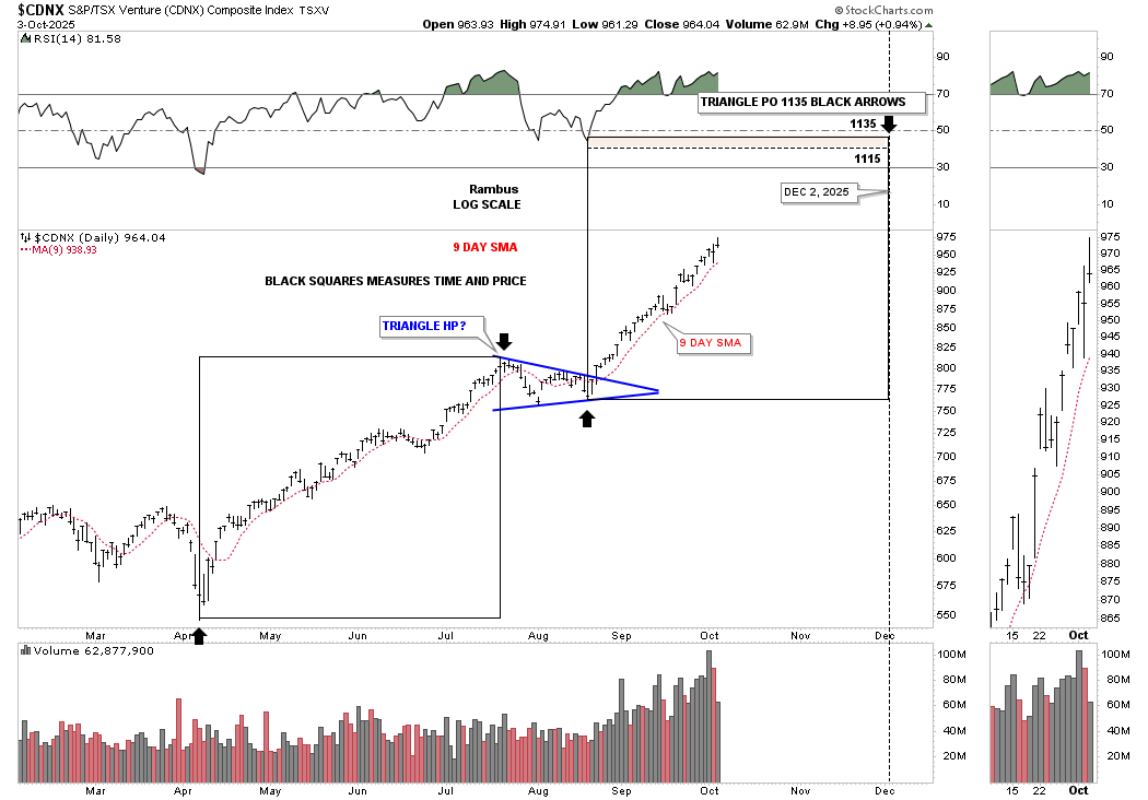
This first chart is the new daily look at the CDNX, which I’m showing the blue triangle as a halfway pattern, as shown by the black arrows. Since the rally has been very strong since the August low, I added the red 9-day SMA as very short-term support. As long as the price action trades above the 9-day SMA, short-term support is still holding, and we’ll just stand back and see what develops.
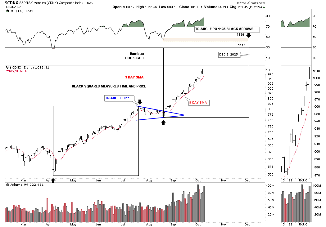
This longer-term double H&S reverse symmetry chart is reaching the previous high made back in 2022 around 1035, where we could see a pause to refresh. The previous high at 910 was gapped over, which is one way to get above overhead resistance.
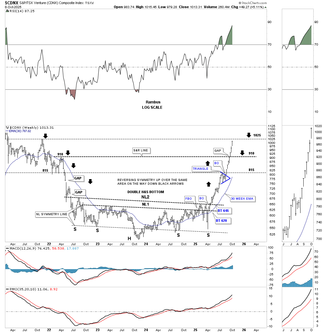
One of the price objectives on the daily chart above is up to the 1115 area, which is the previous high made in February 2021, at the top of the blue 5-point bearish falling wedge reversal pattern, so again that high could cause some hesitation before the CDNX moves higher.

Next up is the daily bar combo chart, which shows the October 2024 bullish rising wedge. I’ve also added the red 9-day SMA for short-term support. After breaking out from its black triangle and then forming the two blue fractal diamonds, and then the bullish rising flag above the two diamonds, SLV’s impulse move has been accelerating.
I’m using this daily line combo chart below to keep a close eye on when the price action will make a lower low, which will be the first possible sign of weakness, but so far, we are still seeing higher highs and higher lows.
Keep in mind that bullish rising wedges are just like any other consolidation pattern, but they show up in a strong impulse move as a running correction. The October bullish rising wedges were just shy of one year old when the price action broke through the top trend line, so if they were a triangle or rectangle, they would look much more impressive. As you know the bullish rising wedge is one of my favorite consolidation because most chartists don’t recognize them for what they are and miss them. Note how the character of the rally has changed since the breakout.
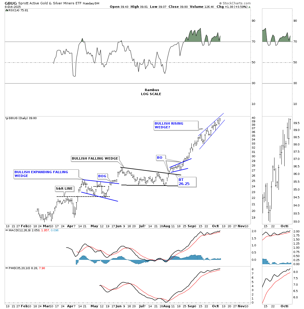
Back in late February of this year, there was a new PM stock index that came online, which is called the GBUG. I’ve been following it, but have never posted a chart, so tonight is the first time I’m showing you this new index. Since its inception, it has been performing very well, forming one consolidation pattern on top of the previous one. About a month or so ago, the GBUG index maybe forming a bullish rising wedge, which has completed 6 reversal points so far. If this new index breaks out to the upside, the other more established PM stock indexes will also be breaking out into new all-time highs, which some are already doing.
Each time we look at this daily combo chart, which shows the April bullish rising wedges in most cases, I keep moving the percentage indicator tool up to reflect how strong this current leg of the rally has been since the August low.
Next is the weekly chart for the GDX, which shows its multi-year H&S consolidation pattern with the price action now getting close to the minimum price objective. Keep in mind that is the minimum price objective, but with a base that large, a much higher price objective would be expected over time.
This other weekly chart for the GDX shows a similar price objective based on two completely different chart patterns: the May 2022 six-point triangle and the October 2024 six point bullish rising wedge.
The GDX has a similar setup with its multi-year H&S consolidation pattern, with the price action getting close to the minimum price objective. I normally use the 30-week EMA for the sell/stops, which gives the price action a little wiggle room. On this chart, I’m using the red 15-week EMA, which tightens up the wiggle room and could be the first sign that the price action is starting to weaken. For now, it’s something we can watch.
And just like the GDX the GDXJ also shows the two consolidation patterns with a similar price objective as the H&S consolidation pattern above.
Today, gold finally reached its next price objective, up to the 4000 area, based on the small blue bullish rising flag, as shown by the blue arrows. You can see there is still another higher price objective based on the black April, 8-point triangle halfway consolidation pattern, up over the 4200 area, shown by the black arrows.
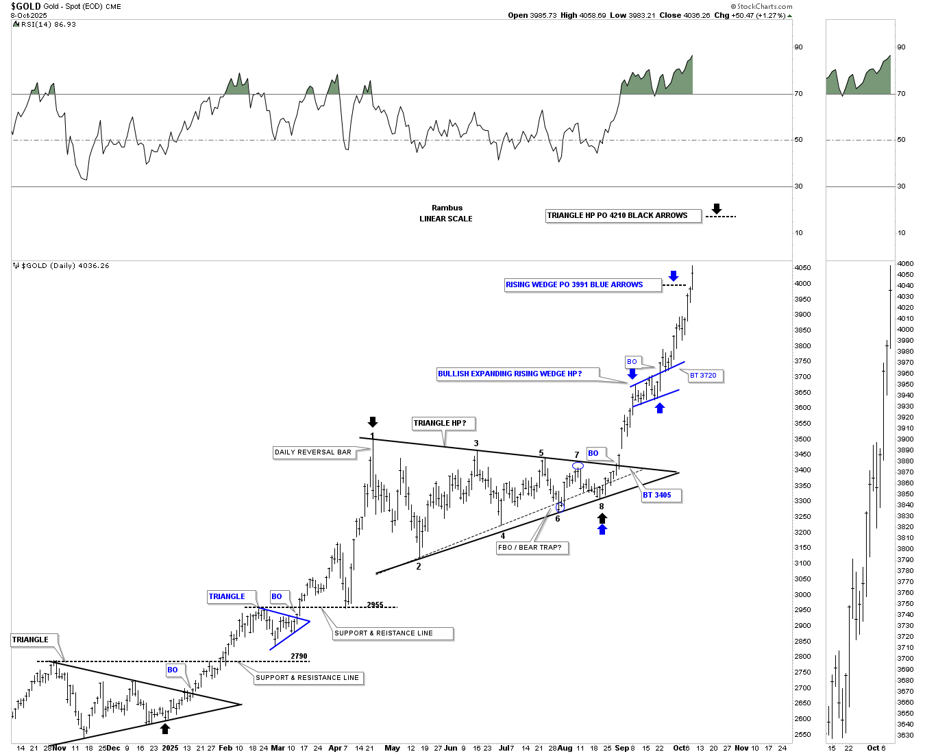
Since breaking out from its 2020 bullish flat-top expanding triangle, gold has formed three small blue consolidation patterns, with the most recent one breaking out last month (see daily 8-point triangle above). Today, the price action reached the 4000 milestone, which is pretty amazing when you think about it. The old adage that big chart patterns lead to big moves applies to this chart.

Just to put this bull market into perspective, below is the combo chart which shows the history of the secular bull market for silver and gold going all the way back to 2000. That old adage that says big chart patterns lead to big moves – just step back a moment and look at the size of those 2011 bases. Those are massive, and the rally phase since the breakout above the necklines is still very young yet. Look at the rally leading into those very large H&S consolidation patterns to get a better understanding of what is to come over the coming years. Bases that large just don’t burn out overnight.
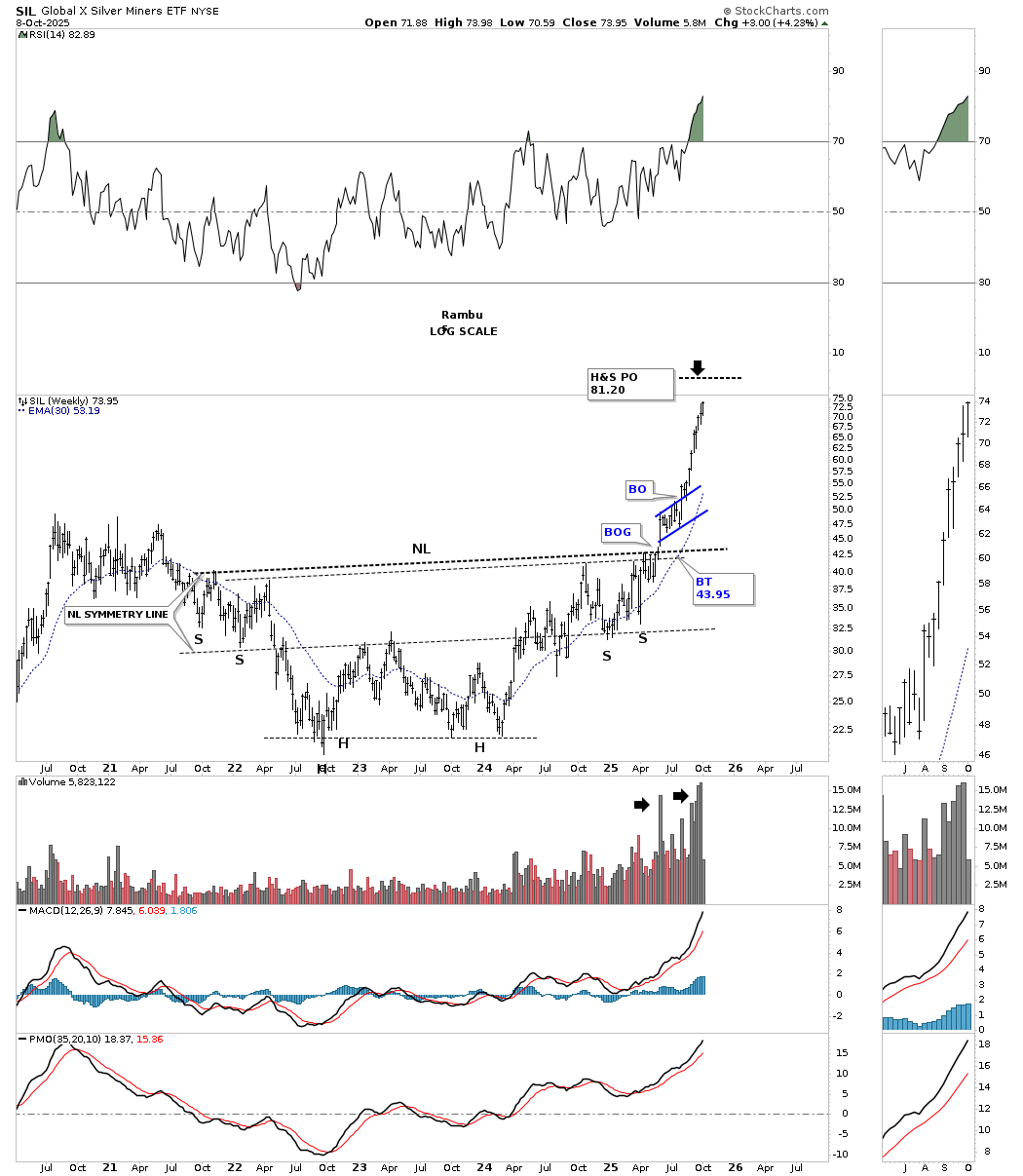
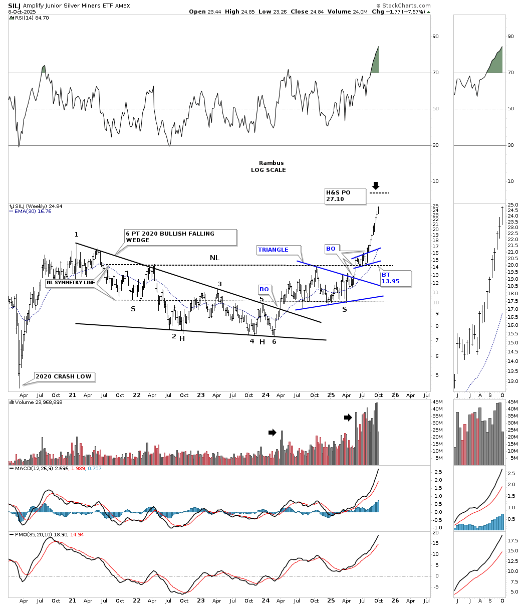
SIL multi year H&S consolidation pattern.
SILJ multi year H&S consolidation pattern. Note the double base which consists of the 2020 six point bullish falling wedge/H&S consolidation pattern.
Let’s look at a few individual PM stocks which are suggesting there is still more life in this very large rally that has really been underway since the 2022 low in most cases. There are still many short-term bullish rising wedges, with a few rectangles and some H&S bottoms.
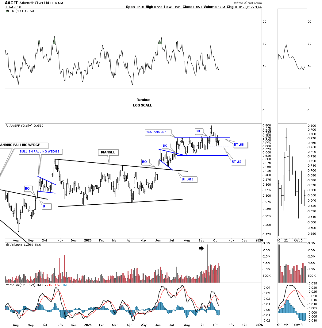
AAGFF formed a pretty symmetrical rectangle consolidation. Many times, when a rectangle fails after the breakout to gain much momentum to the upside and fails the backtest, in regards to a rectangle, the center dashed midline can offer the backtest low before the price action moves higher. This will be a good test right here.
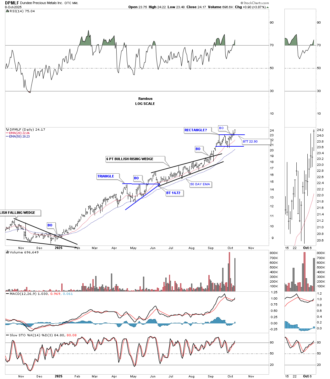
DPMLF broke out from its small rectangle on Monday and backtested the top trendline yesterday.
The dominant short-term consolidation pattern is either a bullish or bearish rising wedge or flag. Keep in mind, if the bottom rail is broken to the downside, then you have a bearish rising wedge or flag.
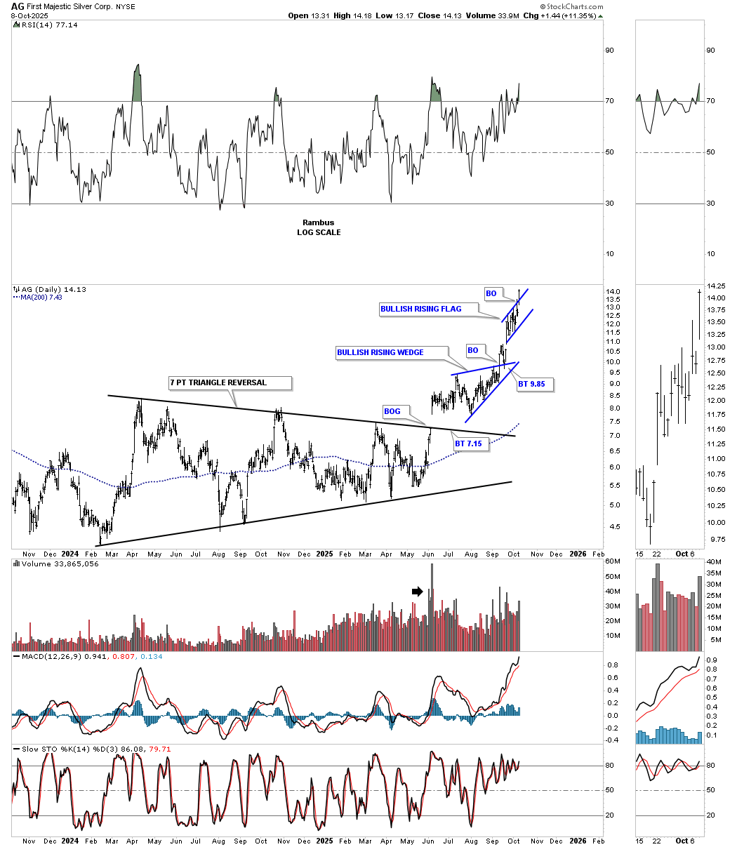
Earlier, AG daily broke out from the bullish rising wedge and now the bullish rising flag.
I mentioned early on in this epic rally that I thought many of the old guard PM stocks would finally come back to life after being beaten down for so long.
AU daily: Is the breakout going to hold?
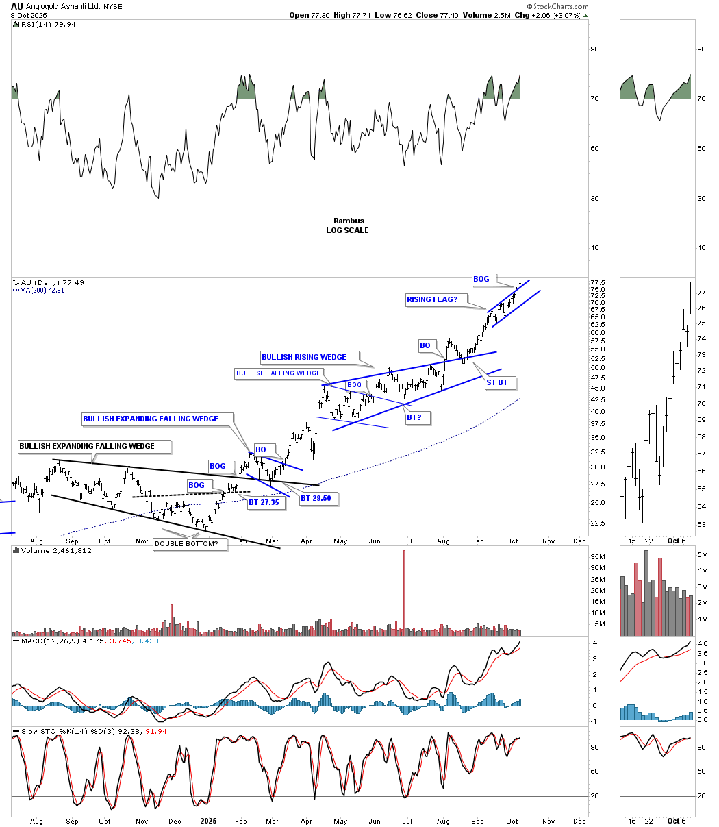
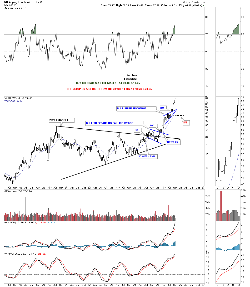
AU weekly: The smaller rising flag on the daily chart above hardly shows up on this weekly chart for AU.
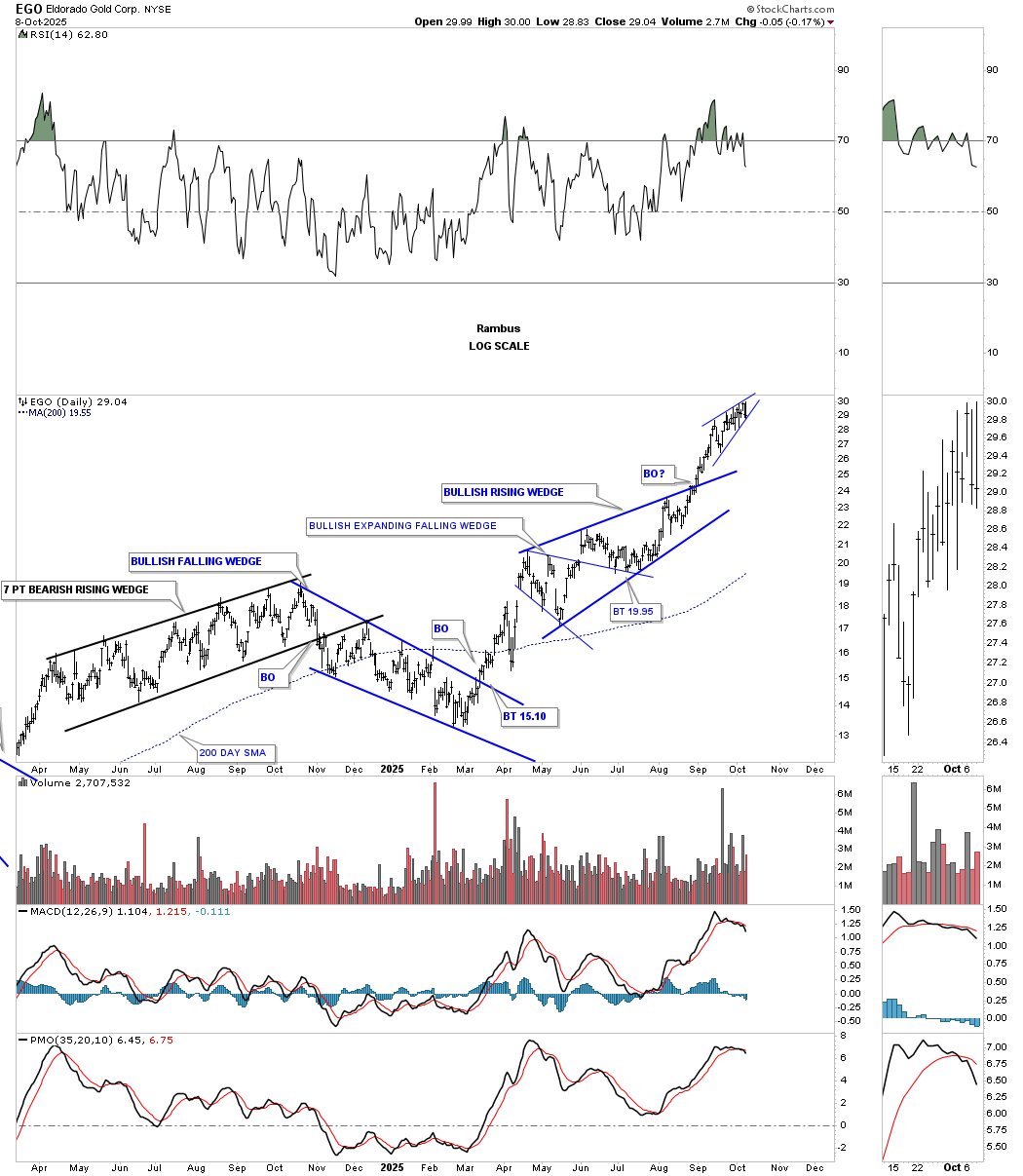
EGO: Watch the direction of the small rising wedge breakout.
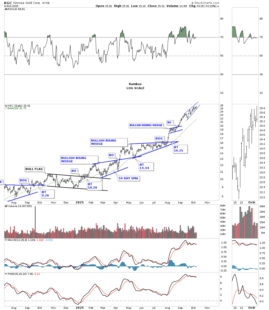
KGC watch the direction of the wedge breakout.
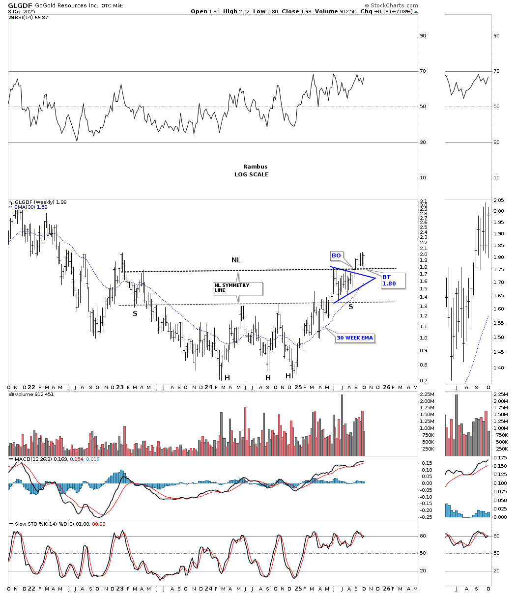
GlLGDF H&S bottom:
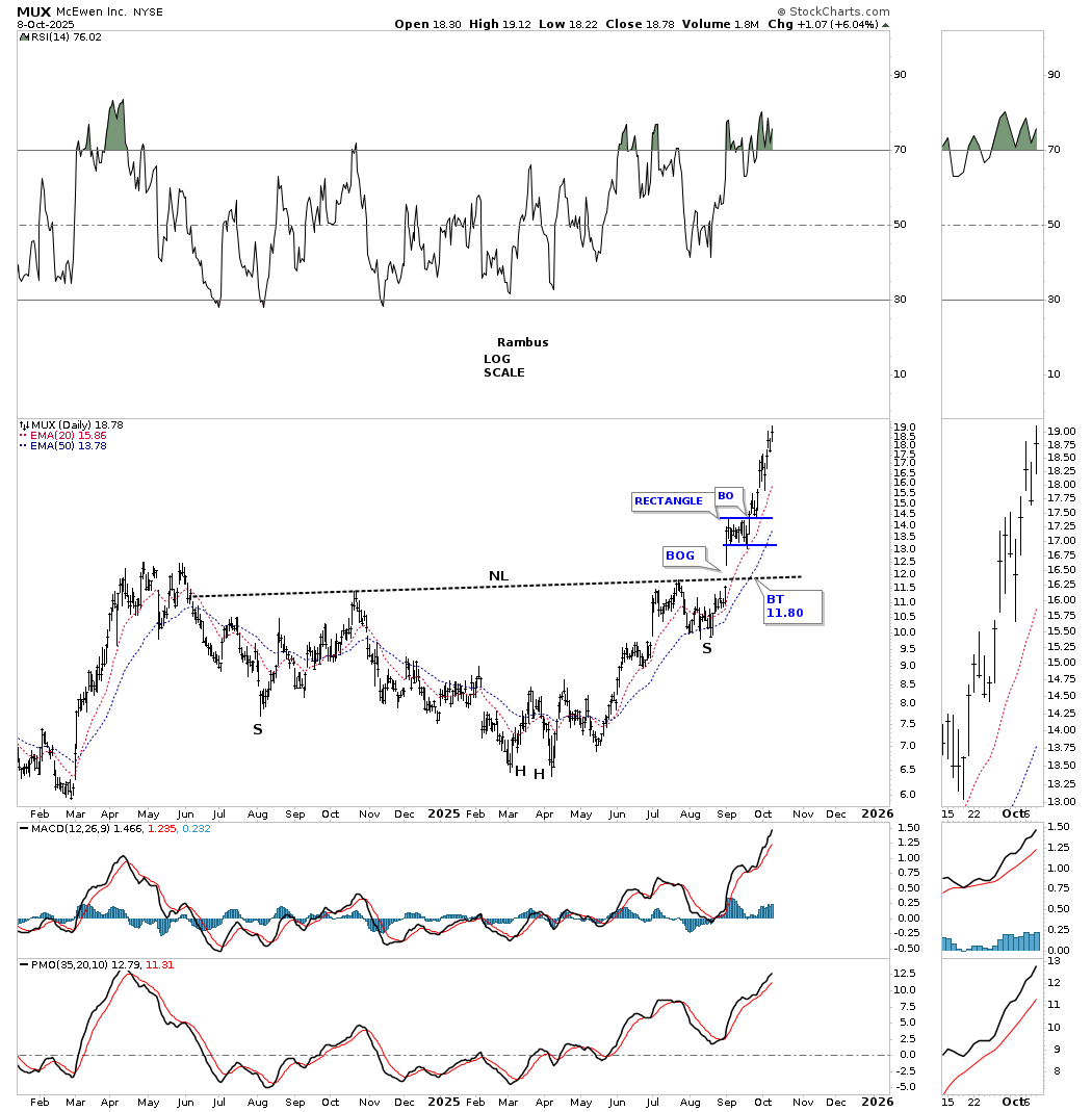
The MUX H&S bottom we looked at just below the breakout looked alot like GLGDF now.
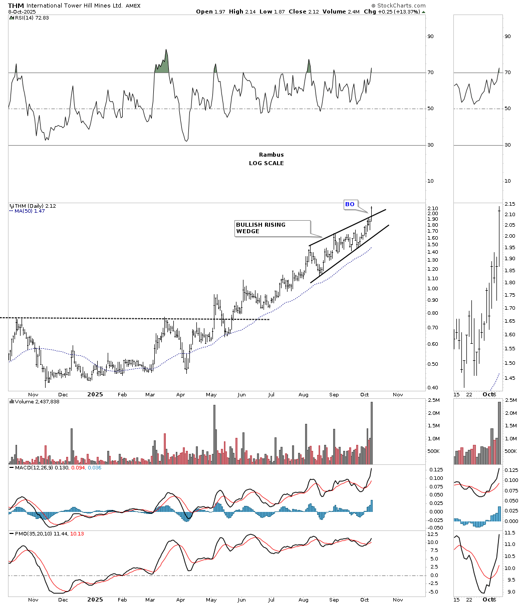
THM breakout today on a large increase in volume.
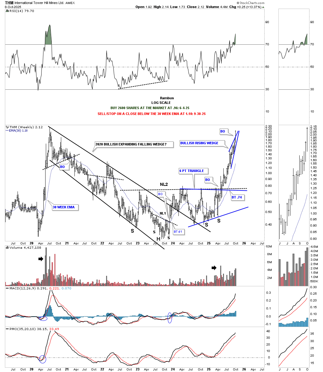
THM weekly for perspective.
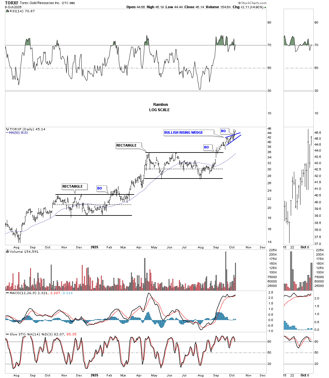
TORXF daily:
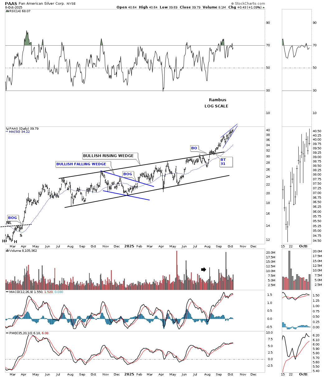
PAAS daily black one year bullish rising wedge with the small blue rising wedge.
I had many more charts I was going to post, but for some reason, when I download the chart, the annotations are changing and not staying where they belong, so I apologize for some of the charts.
What we do know is that the PM complex has been in a very strong rally and is getting close to reaching some of the price objectives I’ve been highlighting recently. Gold has reached its big round number of 4000 while silver just reached its all time high today at 50. A strong impulse move can last longer than most think is possible, but there is also a limit on how high the price action can go before it needs some time to consolidate its gains. So far, this has been an easy trade, but I can assure you that it isn’t going to stay this way. All the best… Rambus.
Getting Back to Basics – First Principles
Rambus asked me to fill in for the weekend report. Rather than try to out chart Rambus I thought instead I will offer my perspective on the gold and silver market viewed through the lens of the principles discovered by the great but mostly forgotten market analysts of 100 years ago. I know I mention these men a lot, but that is because I continue to receive value from what they discovered on how markets work. It is a combination of a lot of things: market cycles, market value and psychology.
I could post a list of quotes from these gentlemen, however I do not have access to my notes since I am away from home finishing up a flight course on the Bombardier Global 6500. Yes Fully it’s a Canadian product! I will offer my opinion based upon the principles of these great analyst as to where we are in the bull market. Why is this so important? Well it’s important because it provides us the big picture. I believe the only way to be able to make the BIG money in this bull market is to grasp that big picture in order to have the endurance to hang on during times of high volatility.
Viewing the PM market through this lens has provided me a steady hand on the tiller which has enabled me to capture significant gains in this cycle.
The Three Bull Market Phases
This concept was developed by William P. Hamilton and refined by Robert Rhea in the 1930’s. For me it has been the most valuable tool for investing. Every investor must find what works for himself before he can have the confidence to invest big and go for the big gains. What works for me is finding a sector with great fundamentals that has been abandoned by the market. This works well because once it enters a bull market it essentially becomes a turnaround sector and upside will be pronounced. Once a bull market begins it will undergo three distinct investor psychological phases. The price action will generally mirror these investor psychological phases. Let’s review these.
Phase I: Stocks Return To Known Values . This is where informed investors establish positions anticipating future advances. The general retail investor, for the most part, has no idea that prices are going up albeit slowly and the trend has begun to advance. He is too interested in chasing shiny objects from the maturing bull markets of other sectors. In this phase stocks return to known values .
Phase II: The Mark-Up Phase. This is where stocks begin to advance discounting improved business conditions. This is the longest phase of the three and is also the most deceptive phase. Strangely enough, it is in phase 1 where the easy money is made, In phase II violent secondary reactions will convince investors that the bull is over and they will end up getting knocked off the bull. Somewhere past the mid point of Phase II the point of recognition (POR) occurs and the market surges higher. This is when the retail public finally discovers that a bull market is in effect and they want in. Interesting side note is that Bob Thompson of the mining clock system has stated that people don’t discover that a bull market is in effect until is it 80% into its life cycle.
Phase III: Mania or Blow Off Phase. Think dot come blow off of 1999-2000 or silver in 1979. Those were classics. When your Aunt Hilda wants to trade in her muni bonds to chase what’s hot then you know you are in the mania phase. These don’t last long, three months to a maximum of one year, but if you are in it gains can be impressive and intoxicating.
Where are we now ?
It is my opinion that the PM sector is just now ending phase I. That is stocks have now returned to known values. This helps explain why we have witnessed this relentless unchecked rise over the past 3 months. It seems almost like a phase III mania move, but there is little to no public participation so it can’t be phase III. No, what we are seeing is a beachball which has been held under water getting released. Note the words from Eric Sprott: “When gold went through $2,000 the bankers lost their control over the metal. The same thing has now happened with silver when it passed $35 and silver has far more explosive power.”
Using standard valuation metrics of free cash flow per share the PM stocks are now valued at normal valuations. So that’s what this move is all about, just returning to known values. In other words, phase I. But keep in mind that these stocks have not yet discounted future earnings and FCF, this comes in phase II.
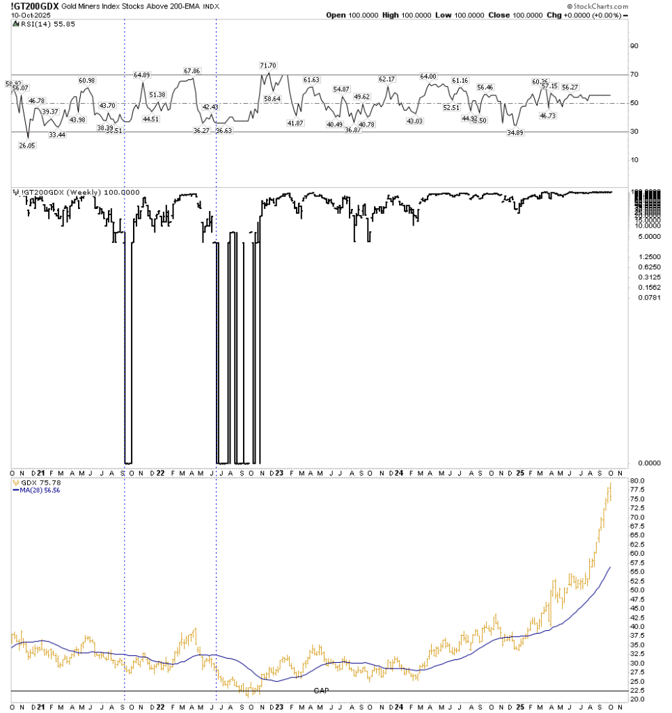
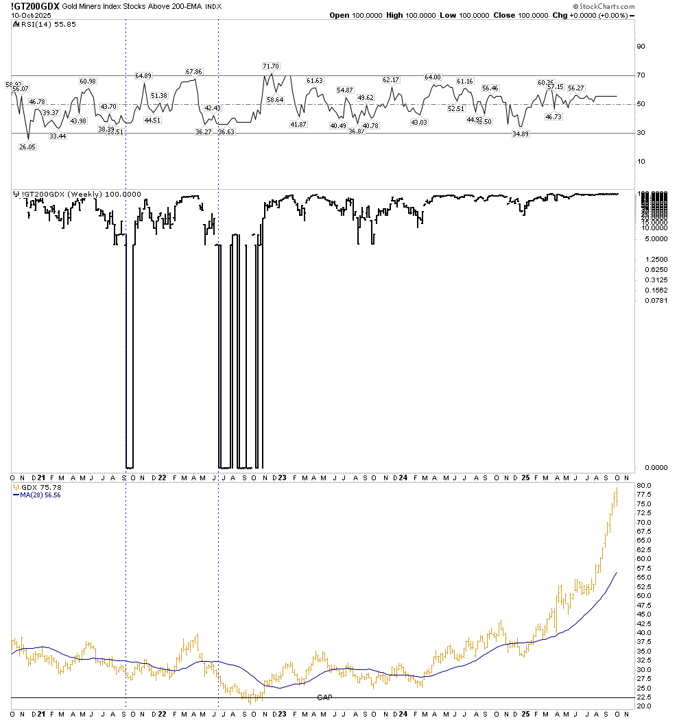
Some say this bull market began in 2019. One can make a reasonable case for this and PM bull markets generally run for about 10 years. So comparing it to past cycles it could run to perhaps 2029. I prefer to identify the start of this bull in September 2022. I have shown this chart before and it shows massive capitulation on the weekly count of stocks above the 200 day moving average. From June to November of 2022 stocks were pinned at zero stocks above their 200 MA. This was the psychological washout required to begin a true bull market.
So phase I ran from Sept 2022 to now. That is a three year period. Previously I thought phase I ended in January of this year, however I think it is more appropriate to classify it as now. Time will tell.
Phase II, being the longest phase, should last over two years likely lasting into late 2027 or 2028. Based on previous markets one would expect a significant market break between the phases. This could be sometime over the next few months, but this is speculation.
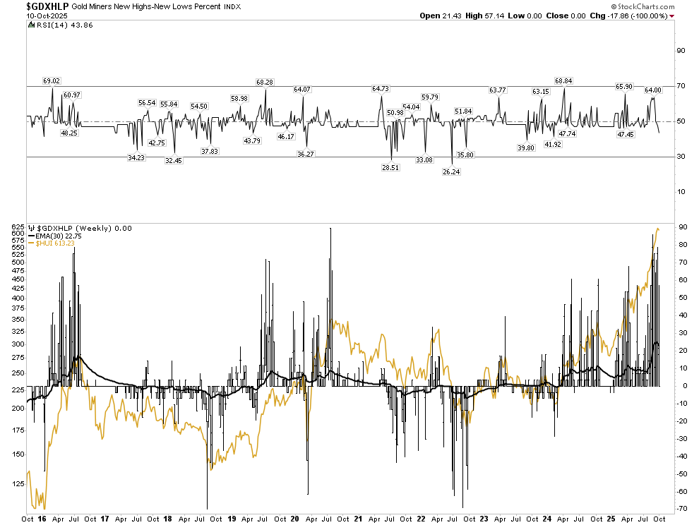
The new highs/new lows chart also confirms the total washout that occurred in the fall of 2022.
Let’s talk possibilities
Rather than throw out tantalizing outrageous upside numbers let’s talk process. From what I am seeing I do think we will witness unthinkably high levels will be reached in gold and silver stocks in this cycle and next cycle. But to achieve capturing gains from this bull market one must have a vision, a plan and a process. This is serious business because the bull wants to throw you off and reach these lofty levels unaccompanied. I often think of a story Richard Russell once told about riding the bull to the top of the great stock bull market from 1982 to 2000. A seasoned investor could have observed how the DOW went nowhere for 16 years between 1966 and 1982. In this time stocks reached high levels of intrinsic value per share, but price didn’t reflect this. Recognizing this he could have bought all around both sides of the bottom over a two year period between 1981-1983. No need to be a market timer, just buy value. If he was a sage student of the market he could have identified the phases of the market and held his positions riding through the ups and downs waiting for all phases to exhibit themselves. Finally when the bull market fully expressed itself on the upside as it did in 1999 in an obvious mania phase III, he finally sold and took his profits. This would have taken 17-18 years. He would have had to weather the crash of 1987 which occurred in phase II, the Gulf War I, the recession of 1992, several short lived crisis in the 90’s, Orange County bond collapse, Mexican crisis of 1995, tech bash of 1997 and others. But in the end by holding onto his stocks he would have made a family fortune and put his family into another economic class for their remaining lifetime.
If one is a disciplined student of the market Russell believed this is achievable, but likely the number of people that accomplished it could be numbered only in the hundreds.
This is why I write to you today, you should be determined to place yourself into this elite group of investors and believe me it is achievable. Frankly I see this present bull market as the market we have waited and trained for our entire lives and I for one, am not going to let it slip away.
The Method-Buy and Hold
This market sector is so volatile that I don’t believe one should actively trade. Most likely you’ll end up on the sidelines watching your stocks accelerate up without you. It’s the old “in it to win it” principle. Maybe trade around the edges of your core positions when the RSI gets into over bought territory, but stay invested until the bull market fully expresses itself to the upside. Remember scared money doesn’t make money .
Another principle is to have the courage to buy near the bottom when it is out of favor and the endurance to hold for the gain.
Also in regard to owning junior exploration or development companies keep in mind words spoken by Rick Rule saying he has never had a 10 bagger that he did not have to ride through a 50% drawdown at least one time and possibly more.
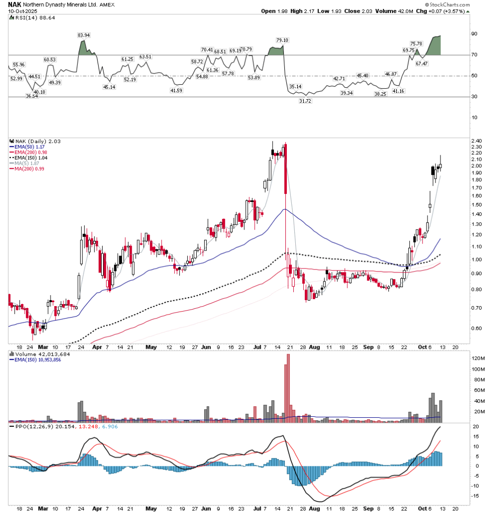
Another quote that never leaves me is the one by Jesse Livermore: A man doesn’t get very far in this business without the courage of his convictions . This means you can’t just buy stocks willy nilly, you’ve got to know them, the people behind them and how they trade. An example of this is recently a friend of mine bought NAK after its recent smash down around 90 cents. He told me he believed it would recover, I wasn’t so sure too I didn’t buy back the shares I sold a few months back before the smash. When it reached $2 this week I congratulated him on his success then he told me he sold it when it hit $1.10. He was afraid he would lose his profit. If one is going to hold these type of stocks you must be in it for the big gain and have the courage of your convictions. Some people just can’t stand making money I suppose.
What should one buy?
Of course I can’t offer any personal recommendations, but I will mention how I have positioned myself for this bull market. I have spread my holdings across different development stages. I hold all the way from greenfield development to mid-tier production. The mid-tier is to capture the rise in FCF that is occurring right now from the elevated gold price. Companies such as Oceania Gold, K-92, Westdome and Endeavour Mining are hitting on all cylinders yet still don’t reflect a future rise in the gold price which I believe is still ahead of us. Next I hold quality development companies such as ARMN, GMINF and Ivanhoe, which are on their way to becoming tier 1 major mining companies. Of course I also hold a number of quality royalty companies, EMX, Empress, Orogen, TFPM and others. Finally, I hold a number of greenfield to brownfield exploration and development juniors.
The Juniors-How to approach them
Juniors are high risk tricky propositions, but offer outstanding upside returns. The average investor should not consider himself qualified to decide which ones to buy. The sector is fraught with risk and lifestyle companies. There are an army of people out there who would love to take your money and run a lifestyle company. What could be better than to let OPM support you and make you believe you are some kind of a big shot telling stories at conventions and the like. Believe me these people are out there. Instead it is best to let other highly qualified people to pick the companies for you.
This is why I have made a major investment in Dundee Corp (not Dundee PM). Johnathon Goodman has spent a lifetime in the junior sector and is known for his due diligence of development projects. I buy the stock (DDEJF) and let him do the stock picking and management at a discount no less, since the market is not pricing Dundee stock equal to the sum of its components.
I also hold a number of Mike Gentile picks. Mike is known for his detailed analysis of value and the elements it takes to be a successful project. He is going for the 20-50 baggers and makes sure they have all the components to get there. He admits that some won’t work out, but at least they have been properly vetted and you won’t be getting any lifestyle companies.
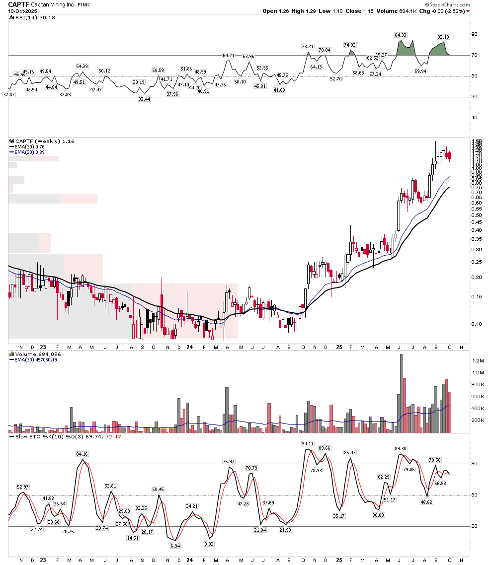
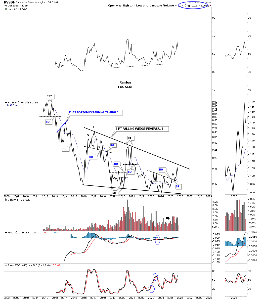
Finally, for over 10 years I have held a major position in Riverside Resources. This company was started by John-Mark Staude and Rick Rule and is the opposite of a life style company. Tightly run and very conservative with one of the best geologists in the world who also is a superb businessman with an incredible unstoppable work ethic. Many people look at the stock chart and think it has been a dog. What they don’t see is that Riverside is the mothership to spin offs. Just look at Capitan Silver, if you held it you have made a very nice return and it appears to be the most prospective silver play in Mexico run by Mexicans who have an inside track in Mexico.
I personally think Capitan has 100 bagger potential from last year’s lows and 10-20 bagger potential from today’s price once the silver bull gets rolling.
Next up for Riverside is the Blue Jay Gold spin off. This is a unique greenfield and brownfield opportunity in Canada. It will begin trading before the end of this year, I will be adding more to my. already significant position. The greenfield project is in Ontario just down the road from Equinox and has high grade potential. Its brownfield project has already discovered high grade gold in excess of 1million oz in the Yukon. It was purchased for a song this summer. The stock likely begins trading sub $10 million market cap.
One last word on Riverside. One reason the stock hasn’t performed is because its prospect generator business model has been out of favor during the prolonged bear market. This is now changing and Matt Geiger has stated that he believes the prospect generator stocks are about to get rerated higher. Here is a chart of Riverside provided by Rambus. One definitely hasn’t missed the train yet.
Silver
I have saved the best for last. Just remember that silver stocks are the most volatile stocks outside of uranium stocks. Don’t hold them on margin and be able to stomach the volatility. But here is where the biggest gains are likely. We have recognized that stocks return to known values in phase I, well that’s where silver stocks are today IMO. This may seem ironic given that silver just hit an all time high, but one must consider the real price of silver vs inflation and the increase of money supply. Silver has returned to known values right here at $50. Silver price suppression is coming off and price can now run and reflect fundamentals. One thing that the late Ted Butler taught me was that the silver market has the structure to advance to levels we can’t even fathom once it gets going. I will save the explanation why for another day. Ted was not a silver nut he was a reasoned analyst and he described the silver market this way: Silver is a Saturn 5 rocket on top of a nuclear bomb. Silver’s short interest along with its tight fundamentals and minuscule above ground supply, combined with its tiny size gives the market the structure to go to levels you cannot conceive of from past performance.
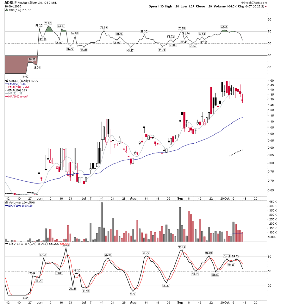
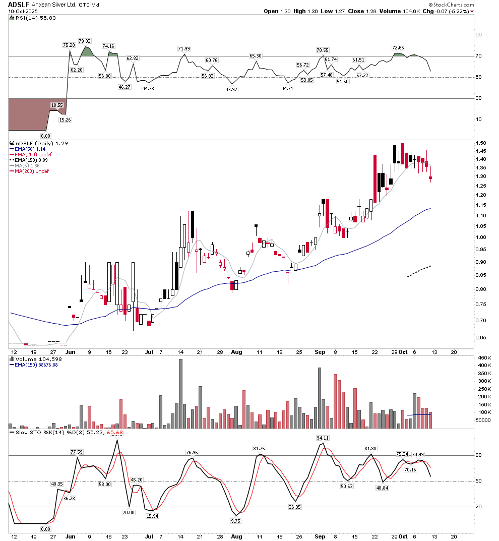
Because of this potential for price gain I hold a probably reckless sized position in various silver stocks, but I am in at a low cost basis so I can ride the volatility. It is here that I believe huge gains can be made. But silver stocks must be selected well as there are a lot of low quality companies that simply have too much risk. One doesn’t have to own the riskier stocks in search of big gains in silver as the quality ones have plenty of upside leverage. I would avoid the group known as the silver animals. Mexico does give me a bit of caution even though I do own Capitan, First Majestic, Vizla and GoGold. US based Hecla and Coeur are likely fine, however I prefer turnaround candidate USAS. PAAS of course is the big cap play which I also own. Aussie based Chilean Andean Silver (ADSLF, ASE:ASL) is one of my favorites.
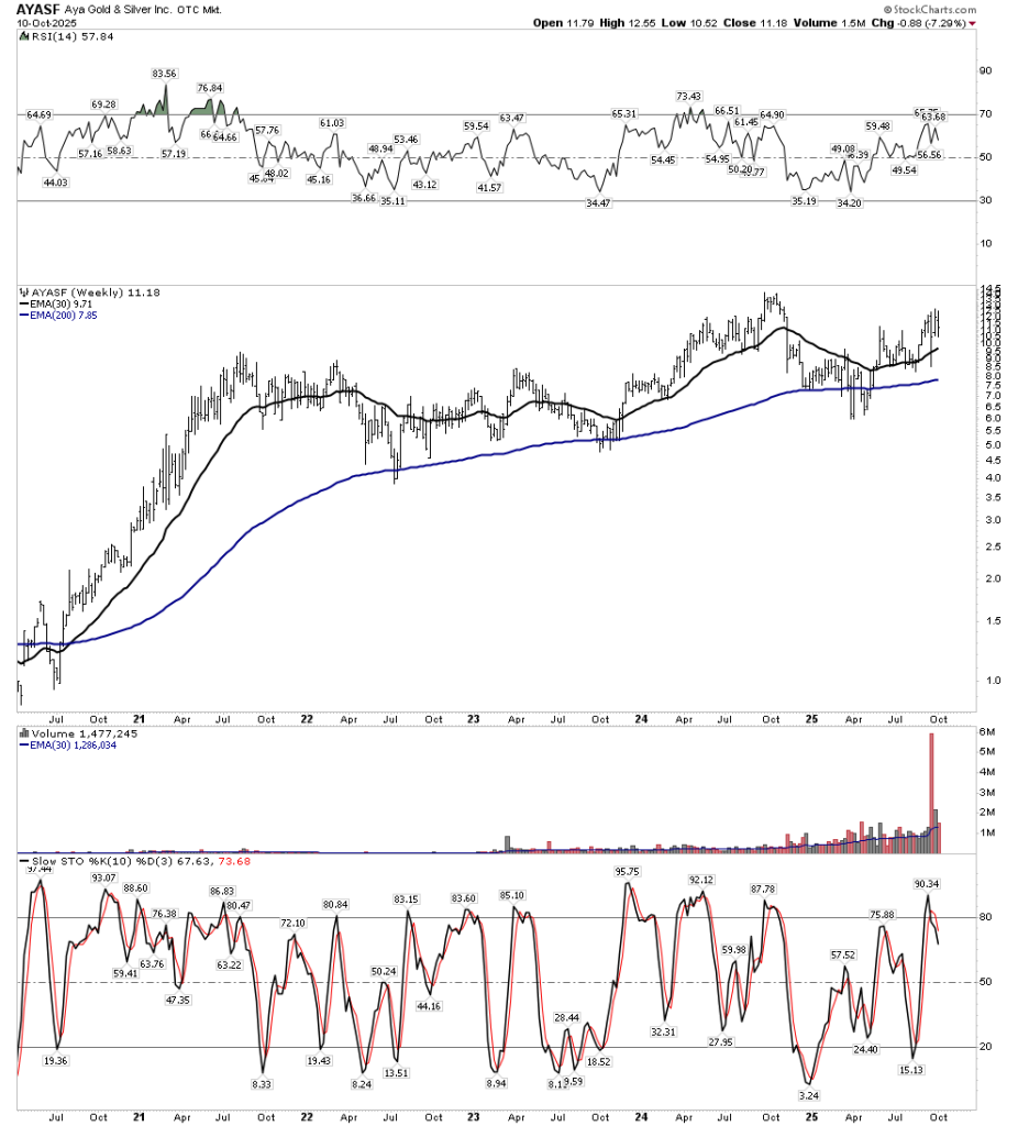
However, by far my favorite silver play is AYA Gold and Silver. I believe it has the best of everything, management, grade, size, location, and is very cheap still. Incidentally, Blue Orca’s trapped short position is a cherry on the top!
Final Comments
This PM bull market is still in its infancy. We know this because there is so little public and institutional participation. The rapid move of the past few months is simply the stocks returning themselves to known values. The fact that they have moved so far only reminds us of how low they were at the end of the last bear market and gives us a clue as to how high they have to go in the future. If you determine yourself to be a student of market cycles and listen to the language of the market you should be able to be in that select group of investors that rode it to the top and put yourself in a different economic class… This is your chance…go for it!
Related Reading:
Rambus: Blockbuster Chartology – July, 2025
Rambus: Blockbuster Chartology – January, 2025
Rambus: Blockbuster Chartology – October, 2024
Rambus: Blockbuster Chartology – July, 2024
Rambus: Blockbuster Chartology – April, 2024
Rambus: Blockbuster Chartology – January, 2024
Rambus: Blockbuster Chartology – October, 2023
Rambus: Blockbuster Chartology – August, 2023
Rambus: Blockbuster Chartology – May, 2023
Rambus: Blockbuster Chartology – January, 2023
Rambus: Blockbuster Chartology – October, 2022
Rambus: Blockbuster Chartology – July, 2022
Rambus: Blockbuster Chartology – May, 2022
Rambus: Blockbuster Chartology – February, 2022
Rambus: Blockbuster Chartology – October, 2021
Rambus: Blockbuster Chartology – July, 2021
Rambus: Blockbuster Chartology – April, 2021
Rambus: Blockbuster Chartology – January, 2021
Rambus: Blockbuster Chartology – October, 2020
Rambus: Blockbuster Chartology – July, 2020
Rambus: Blockbuster Chartology – May, 2020
Rambus: Blockbuster Chartology – January, 2020
Rambus: Blockbuster Chartology – October, 2019
Rambus: Blockbuster Chartology – July, 2019
Rambus: Blockbuster Chartology – April, 2019
Rambus: Blockbuster Chartology – January, 2019
Rambus: Blockbuster Chartology – October, 2018
Rambus: Blockbuster Chartology – July, 2018
Rambus: Blockbuster Chartology – April, 2018
2017 Annual Wrap Up – Does Your Pension Fund Have A Deep State Drain? – January, 2018
1st Quarter Wrap Up 2018 Web Presentation
Blockbuster Chartology with Rambus – October, 2017
Blockbuster Chartology with Rambus – July, 2017
Blockbuster Chartology with Rambus – May, 2017
Blockbuster Chartology with Rambus – January, 2017
Blockbuster Chartology with Rambus – October 20, 2016
Blockbuster Chartology with Rambus – July 21, 2016
Blockbuster Chartology with Rambus – April 21, 2016
Rambus: Are We in a Deflationary Spiral? – January 28, 2016
The Dollar, Gold & the S&P 500 with Rambus – October 15, 2015
