
Maps of the 2012 US Presidential Election Results
Become a member: Subscribe
Solari’s Building Wealth materials are organized to inspire and support your personal strategic and financial planning.

Missing Money
Articles and video discussions of the $21 Trillion dollars missing from the U.S. government
No posts
Maps of the 2012 US Presidential Election Results
 
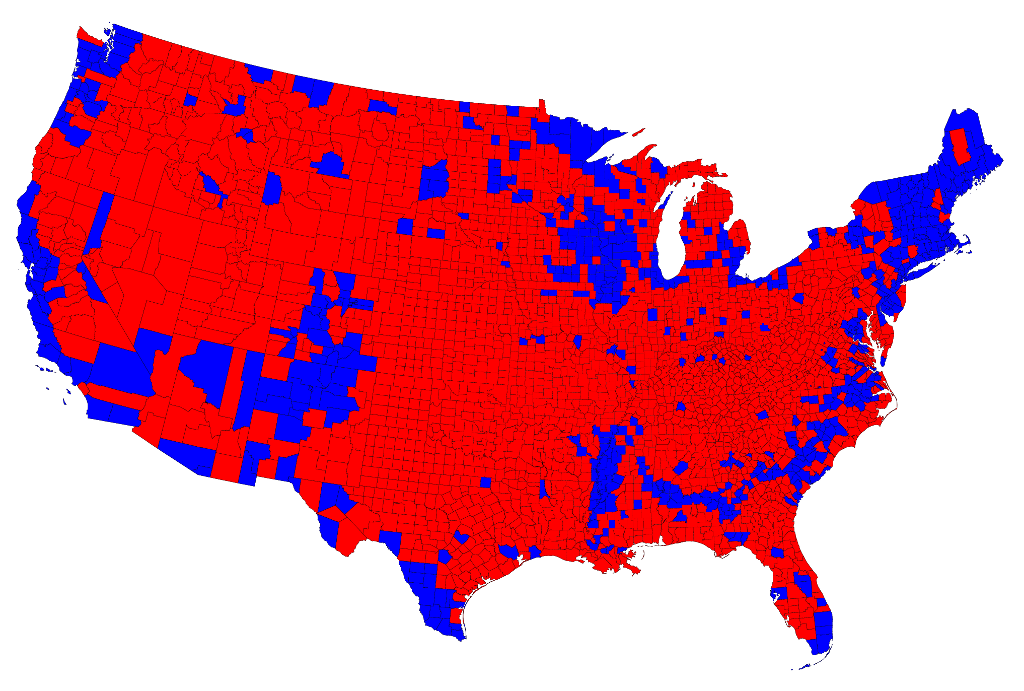
		Here is a map of US counties, again colored red and blue to indicate Republican and Democratic majorities respectively:
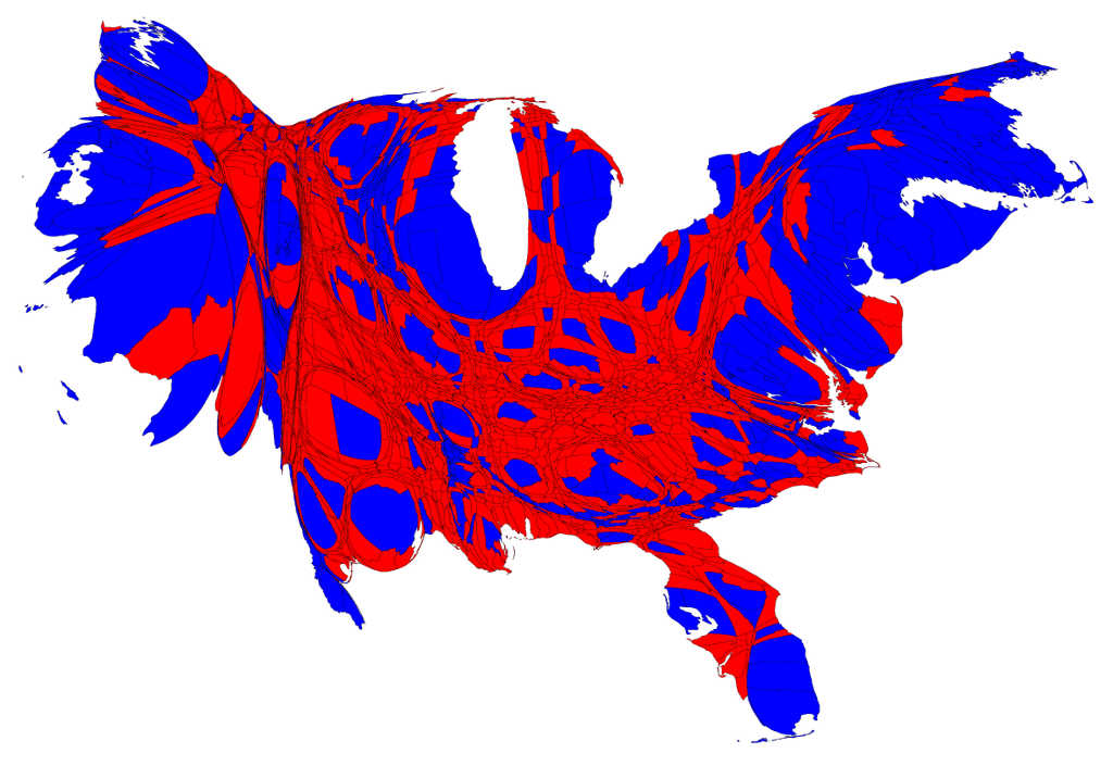
Now the effects we saw at the state level are even more pronounced: the red areas appear overwhelmingly in the majority, an appearance again at odds with the actual results of the election. Again, we can make a more helpful respresentation by using a cartogram. Here is what the cartogram looks like for the county-level election returns:
Our mission is to help you live a free and inspired life. This includes building wealth in ways that build real wealth in the wider economy. We believe that personal and family wealth is a critical ingredient of both individual freedom and community, health and well-being.
Nothing on The Solari Report should be taken as individual investment, legal, or medical advice. Anyone seeking investment, legal, medical, or other professional advice for his or her personal situation is advised to seek out a qualified advisor or advisors and provide as much information as possible to the advisor in order that such advisor can take into account all relevant circumstances, objectives, and risks before rendering an opinion as to the appropriate strategy.
Be the first to know about new articles, series and events.


